library(tidyverse)Lab 09 - Conveying the right message through visualisation
In this lab our goal is to reconstruct and improve a data visualisation on COVID and mask wearing.
Learning goals
- Critiquing visualisations that misrepresent data
- Improving data visualisations to better convey the right message
Getting started
Go to the course GitHub organization and locate your homework repo, clone it in RStudio and open the R Markdown document. Knit the document to make sure it compiles without errors.
Warm up
Let’s warm up with some simple exercises. Update the YAML of your R Markdown file with your information, knit, commit, and push your changes. Make sure to commit with a meaningful commit message. Then, go to your repo on GitHub and confirm that your changes are visible in your Rmd and md files. If anything is missing, commit and push again.
Packages
We’ll use the tidyverse package for much of the data wrangling and visualisation. This package is already installed for you. You can load it by running the following in your Console:
Data
In this lab you’ll construct the dataset!
Exercises
The following visualisation was shared on Twitter as “extraordinary misleading”.
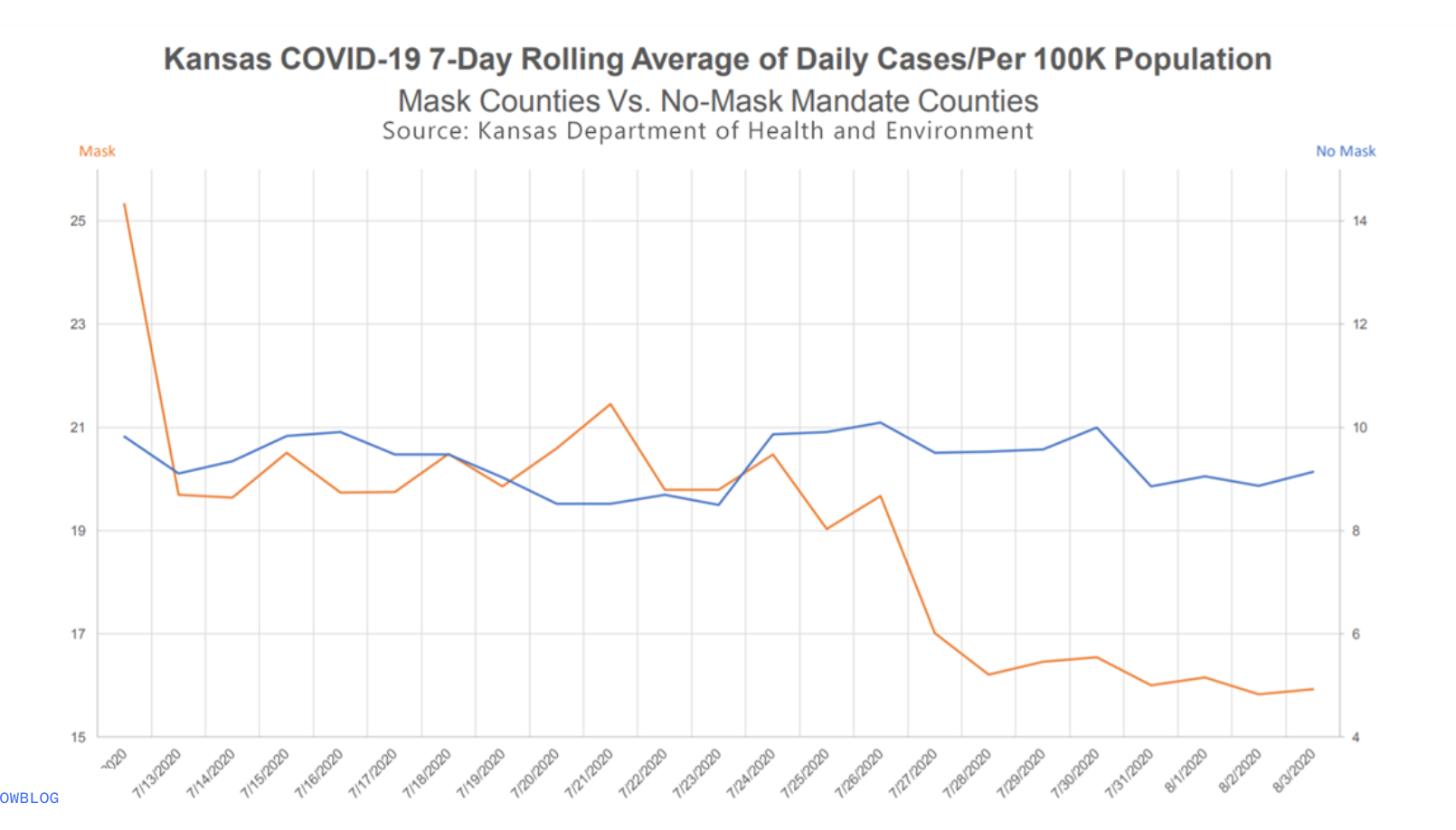
Before you join the workshop, think about what is misleading about this visualisation and how you might go about fixing it. Take some notes and bring your notes to the workshop to share with your teammates.
- Create a data frame that can be used to re-construct this visualisation. You may need to guess some of the numbers, that’s ok. You should first think about how many rows and columns you’ll need and what you want to call your variables. Then, you can use the
tribble()function for this. For example, if you wanted to construct the following data frame
df# A tibble: 3 × 2
date count
<chr> <dbl>
1 1/1/2020 15
2 2/1/2020 20
3 3/1/2020 22you can write
df <- tribble(
  ~date, ~count,
  "1/1/2020", 15,
  "2/1/2020", 20,
  "3/1/2020", 22,
)
Since the exercises for this week are short it's possible not every team member will get to commit and push **during** the workshop. However each team member should review what was created, fix typos, make edits for better presentation, etc. either during or after the workshop, and before the deadline.Make a visualisation that more accurately (and honestly) tells the story.
What message is more clear in your visualisation than it was in the original visualisation?
What, if any, useful information do these data and your visualisation tell us about mask wearing and COVID? It’ll be difficult to set aside what you already know about mask wearing, but you should try to focus only on what this visualisation tells. Feel free to also comment on whether that lines up with what you know about mask wearing.
🧶 ✅ ⬆️ Knit, commit, and push your changes to GitHub with an appropriate commit message. Make sure to commit and push all changed files so that your Git pane is cleared up afterwards and review the md document on GitHub to make sure you’re happy with the final state of your work.