class: center, middle, inverse, title-slide .title[ # Tips for effective data visualization ] .subtitle[ ##
Data Science in a Box ] .author[ ###
datasciencebox.org
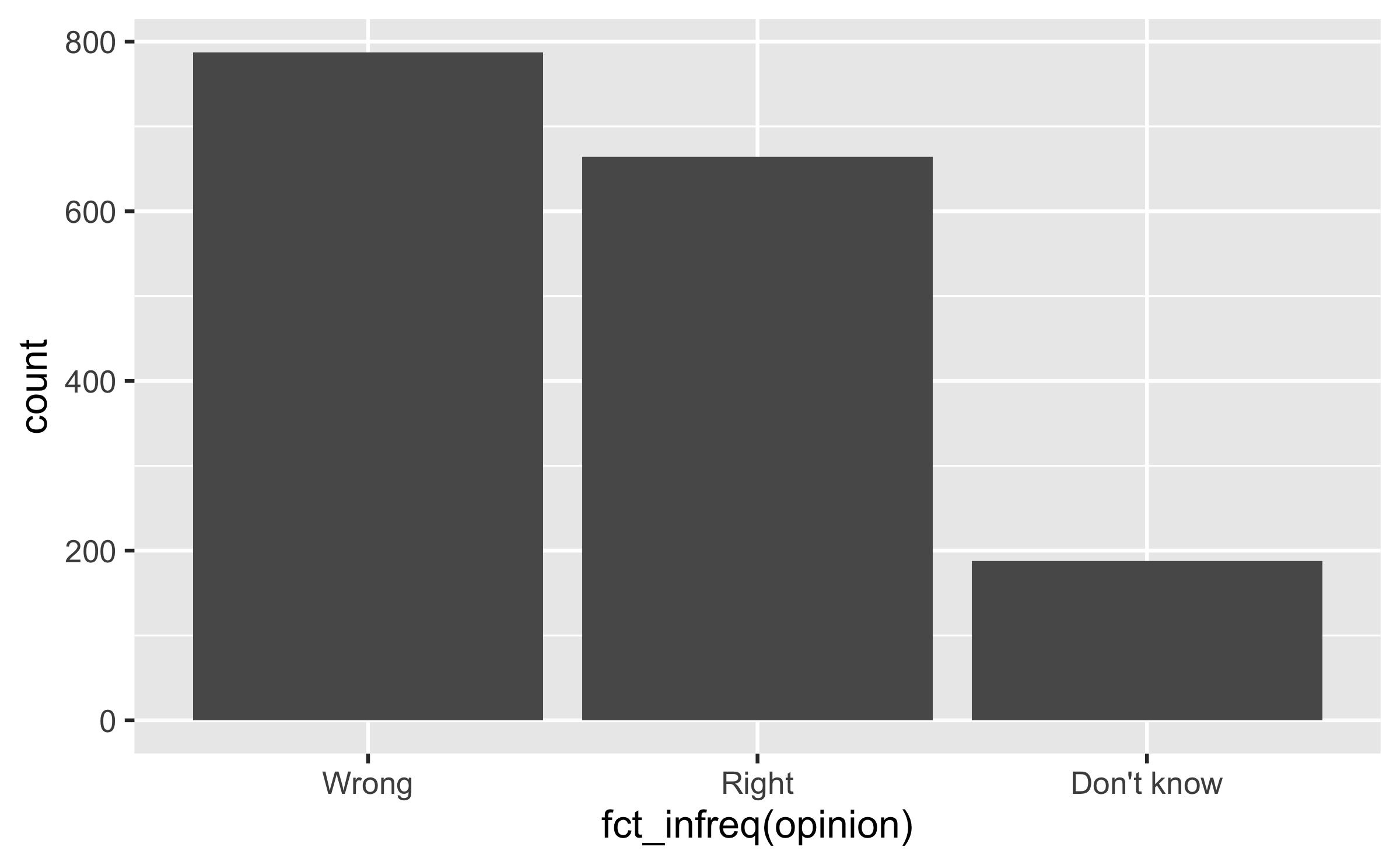
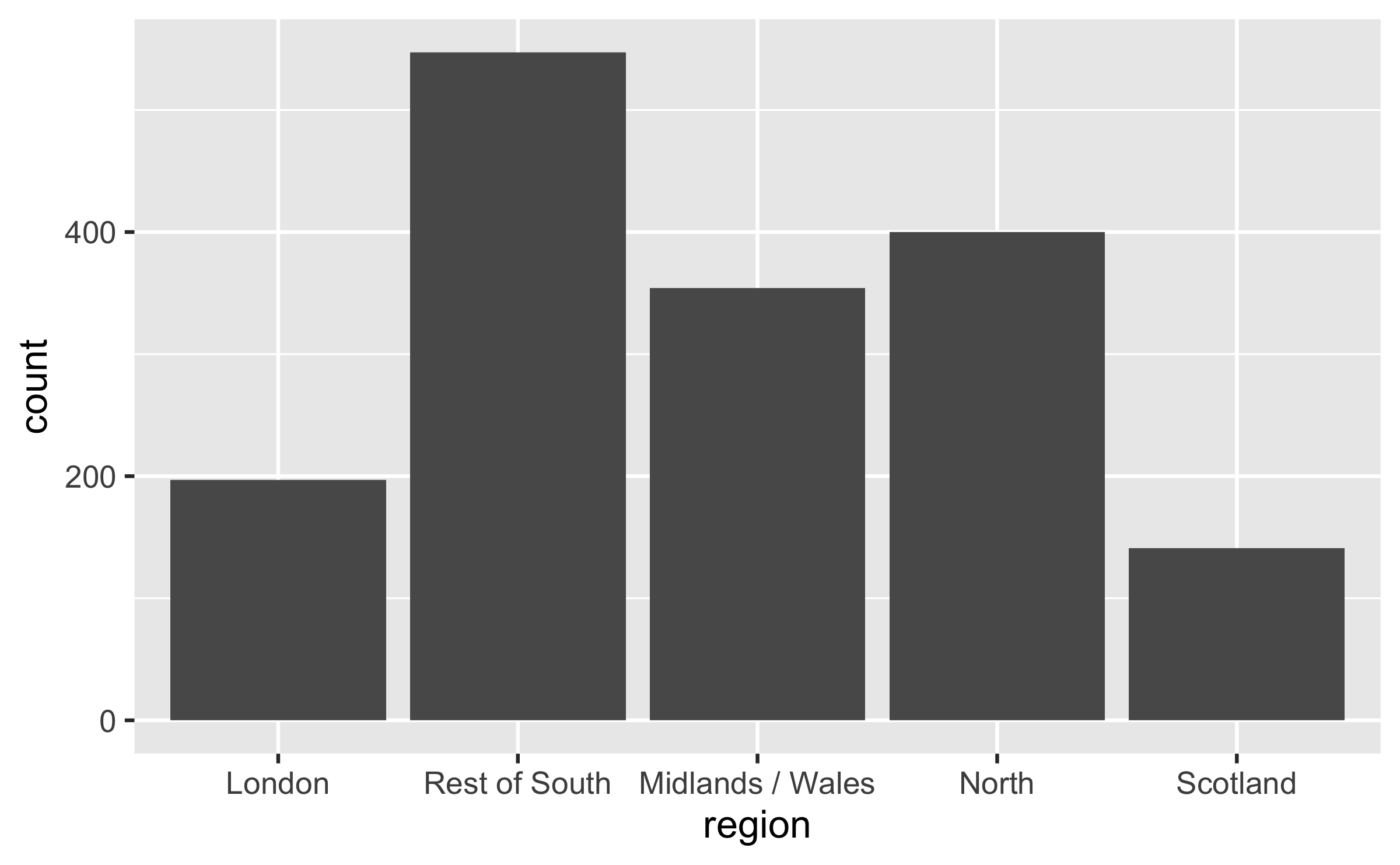
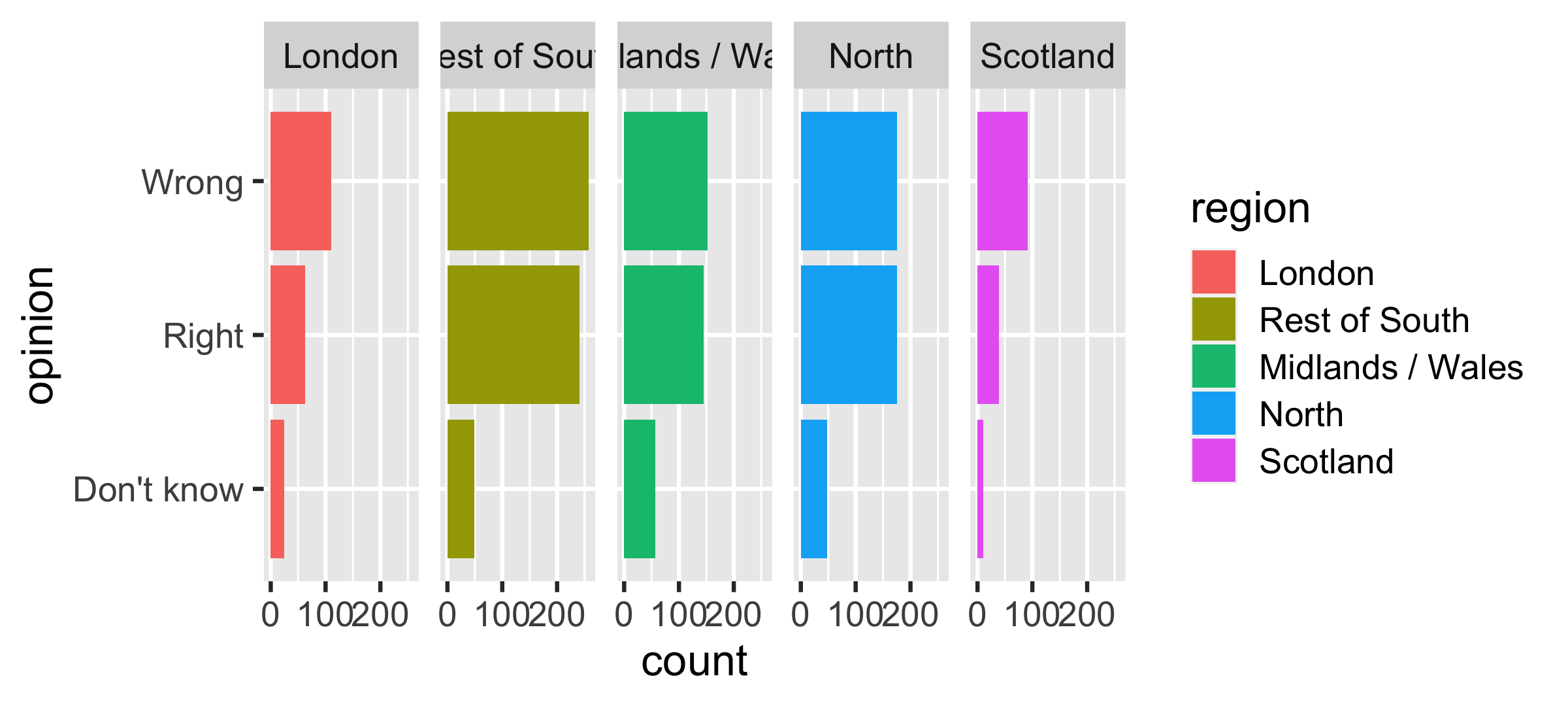
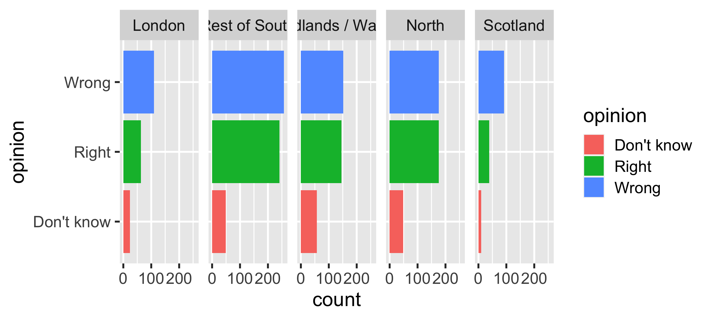
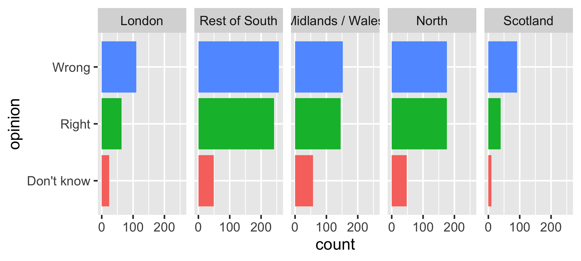
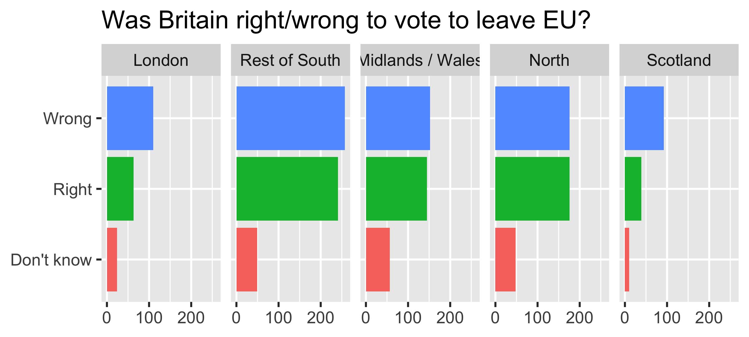
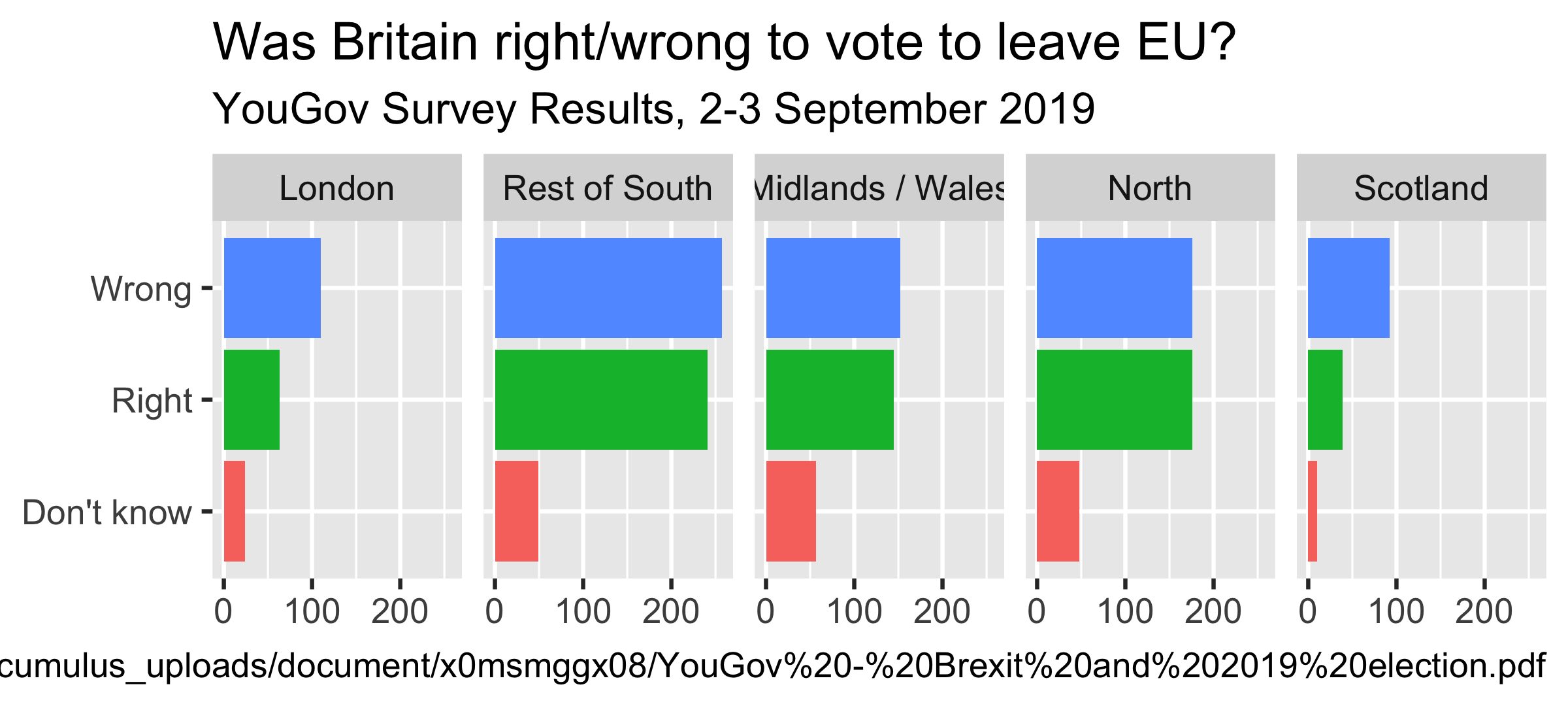
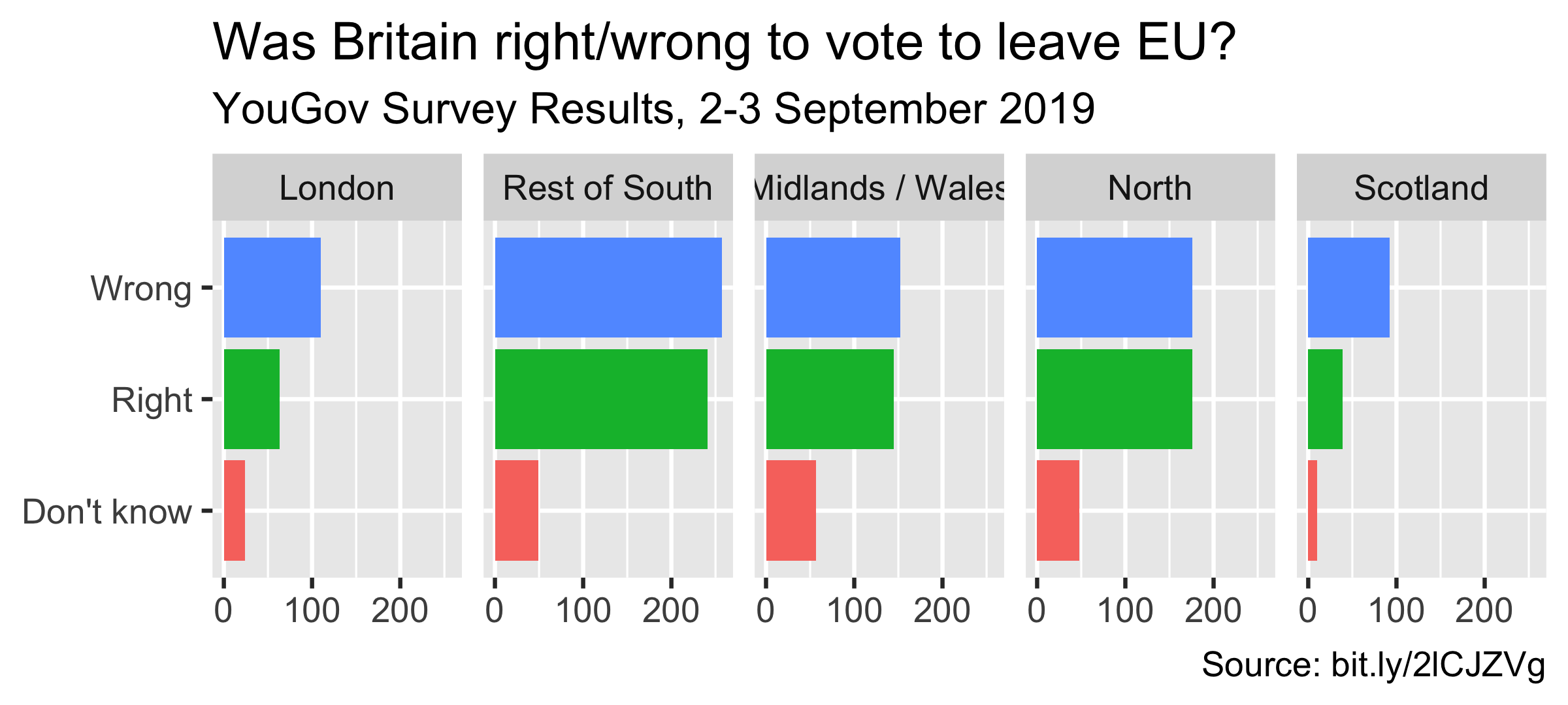
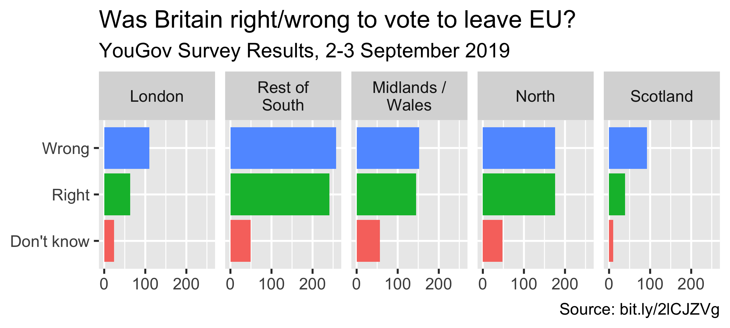
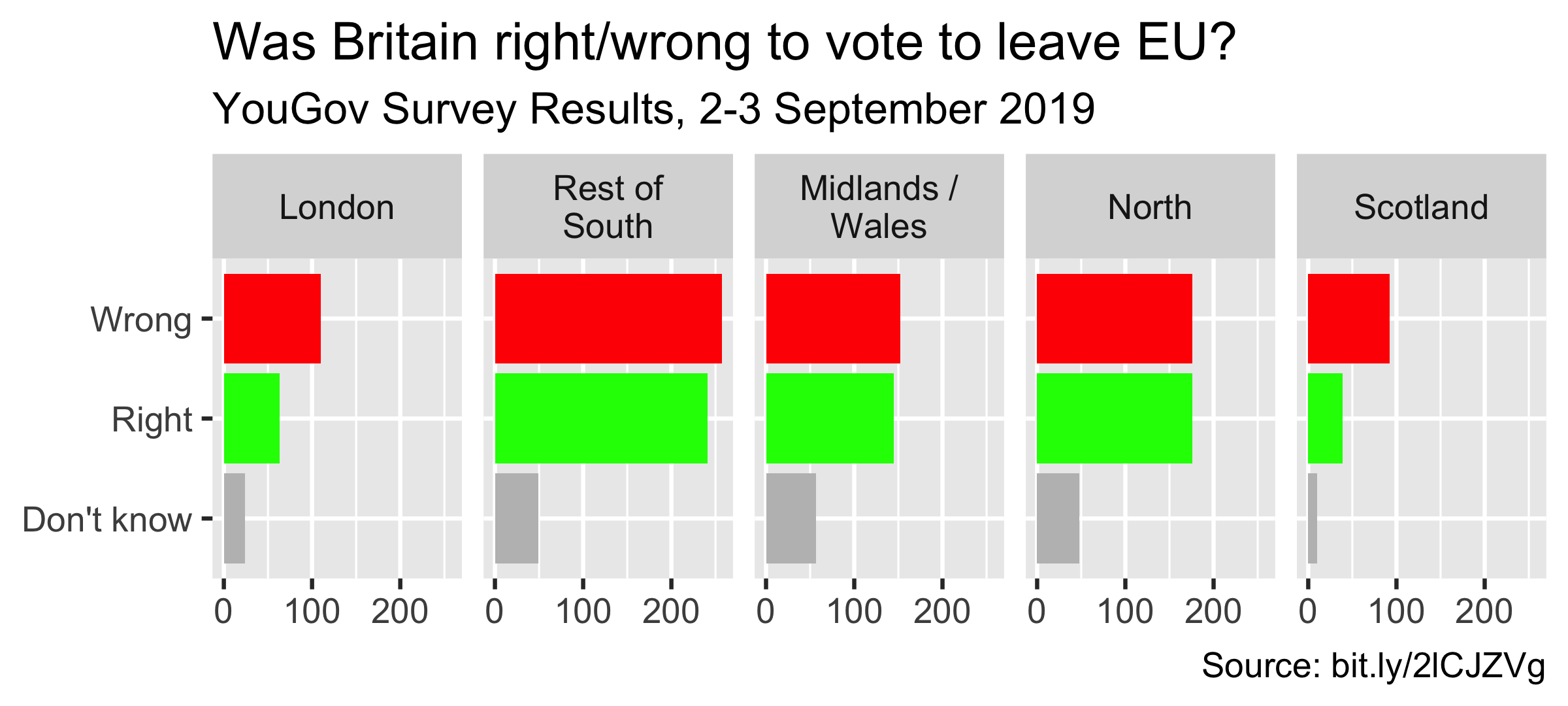
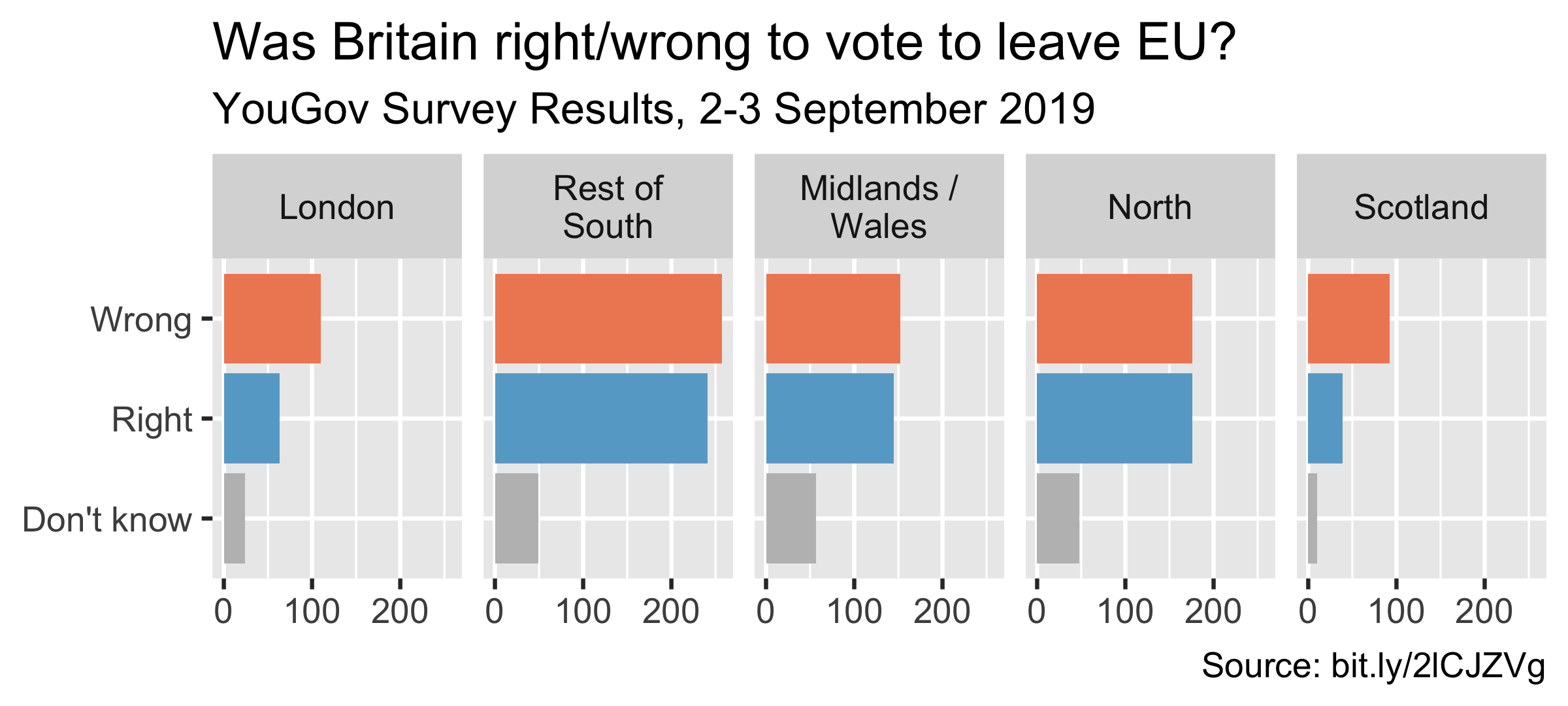
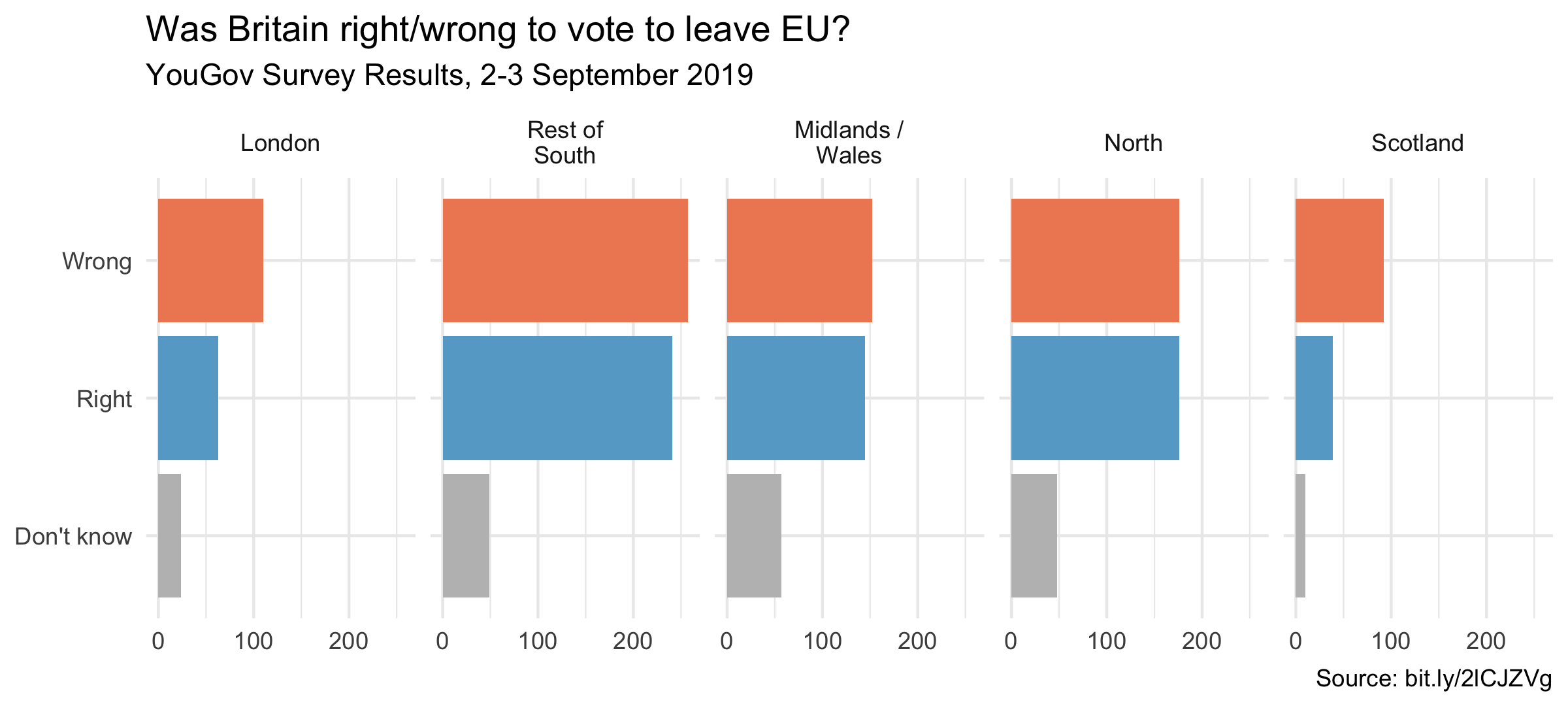
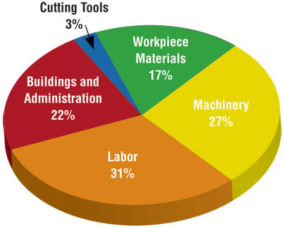
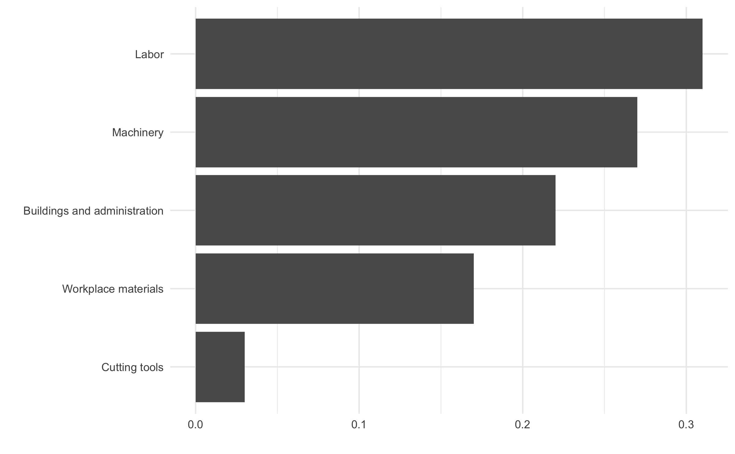
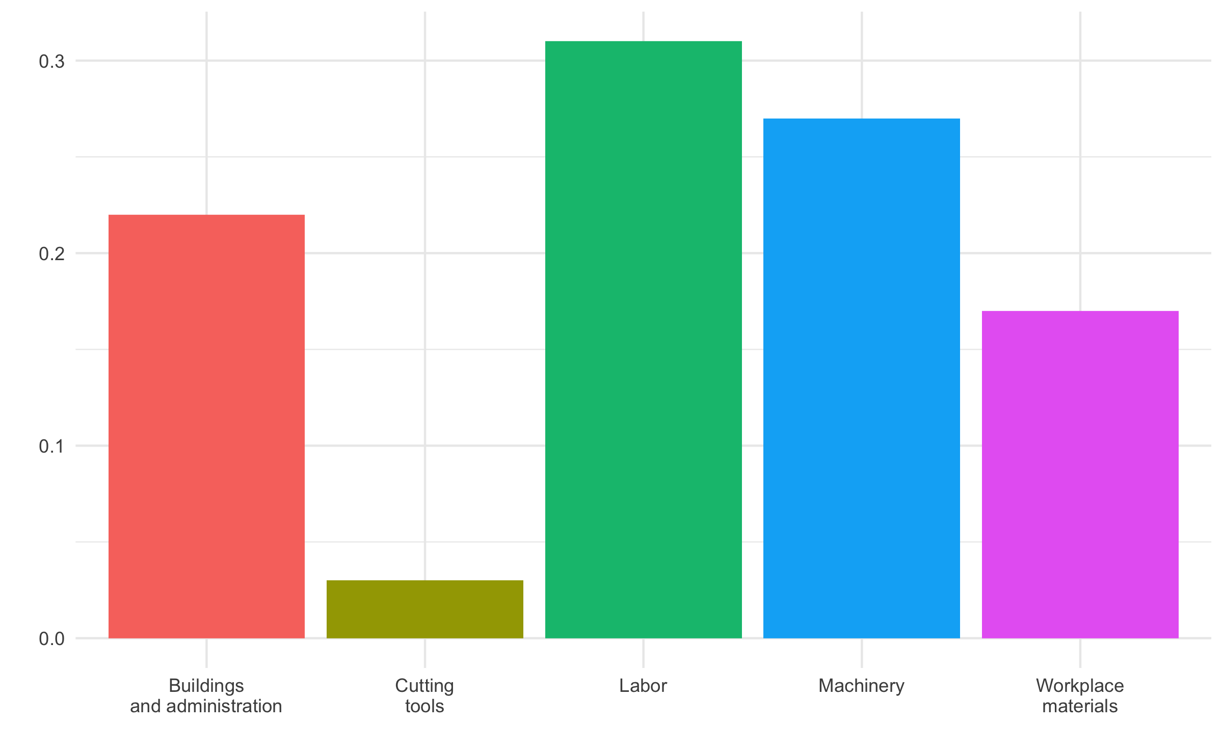
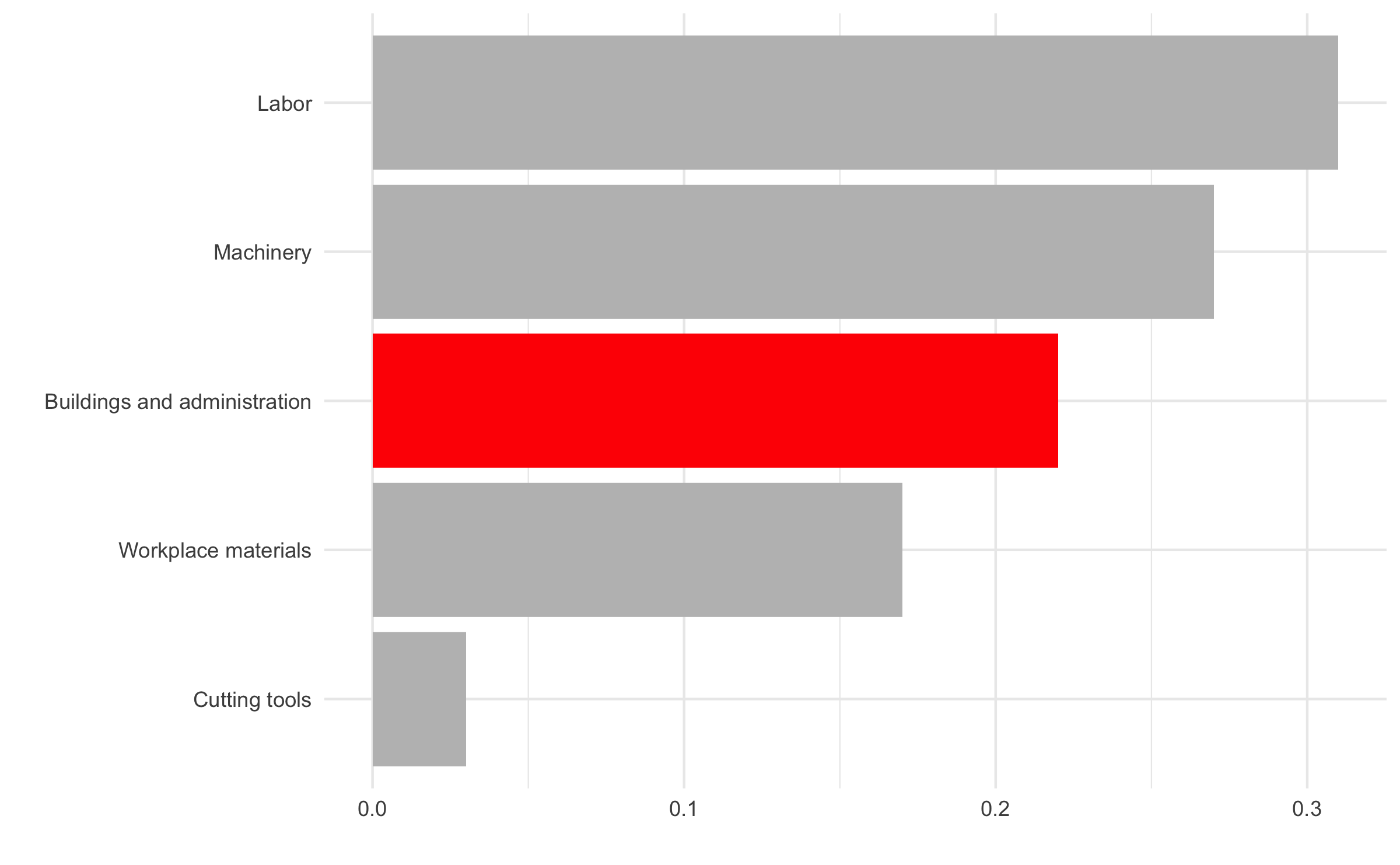
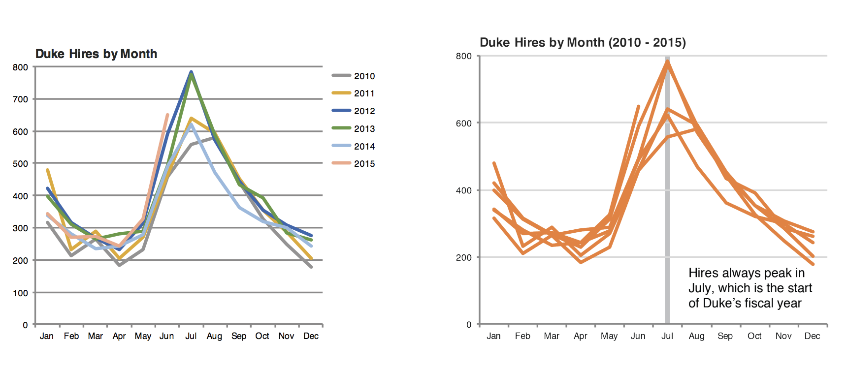
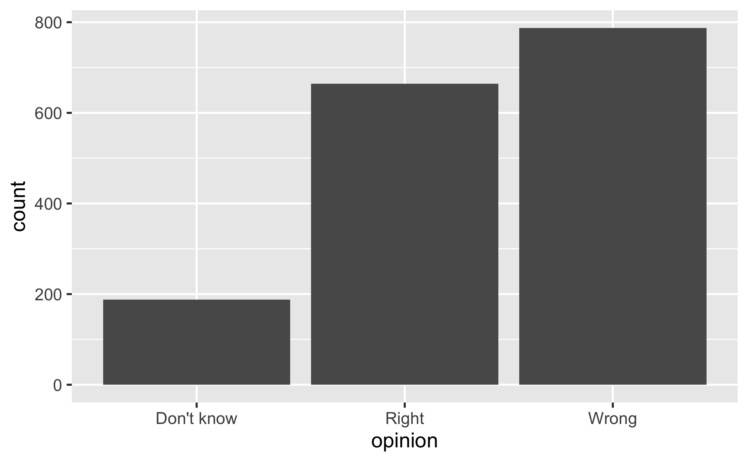
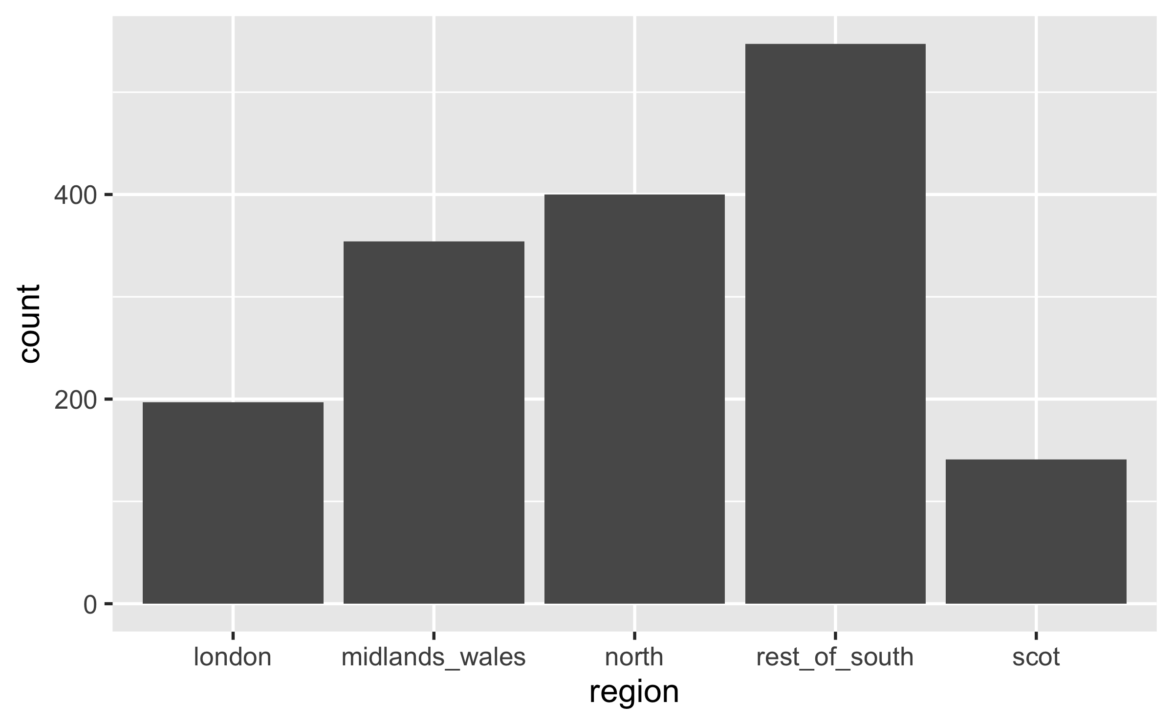
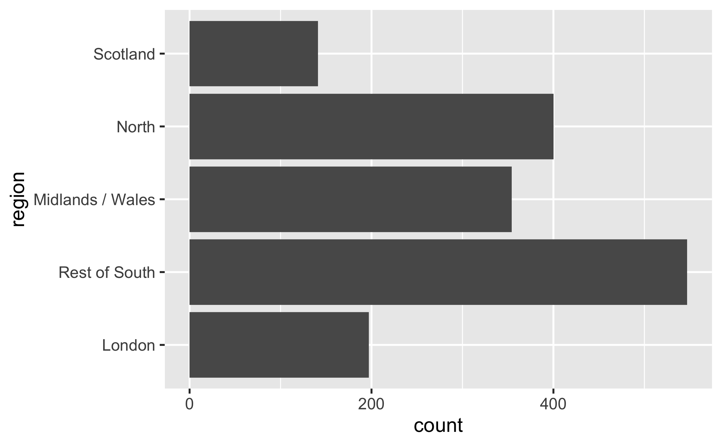
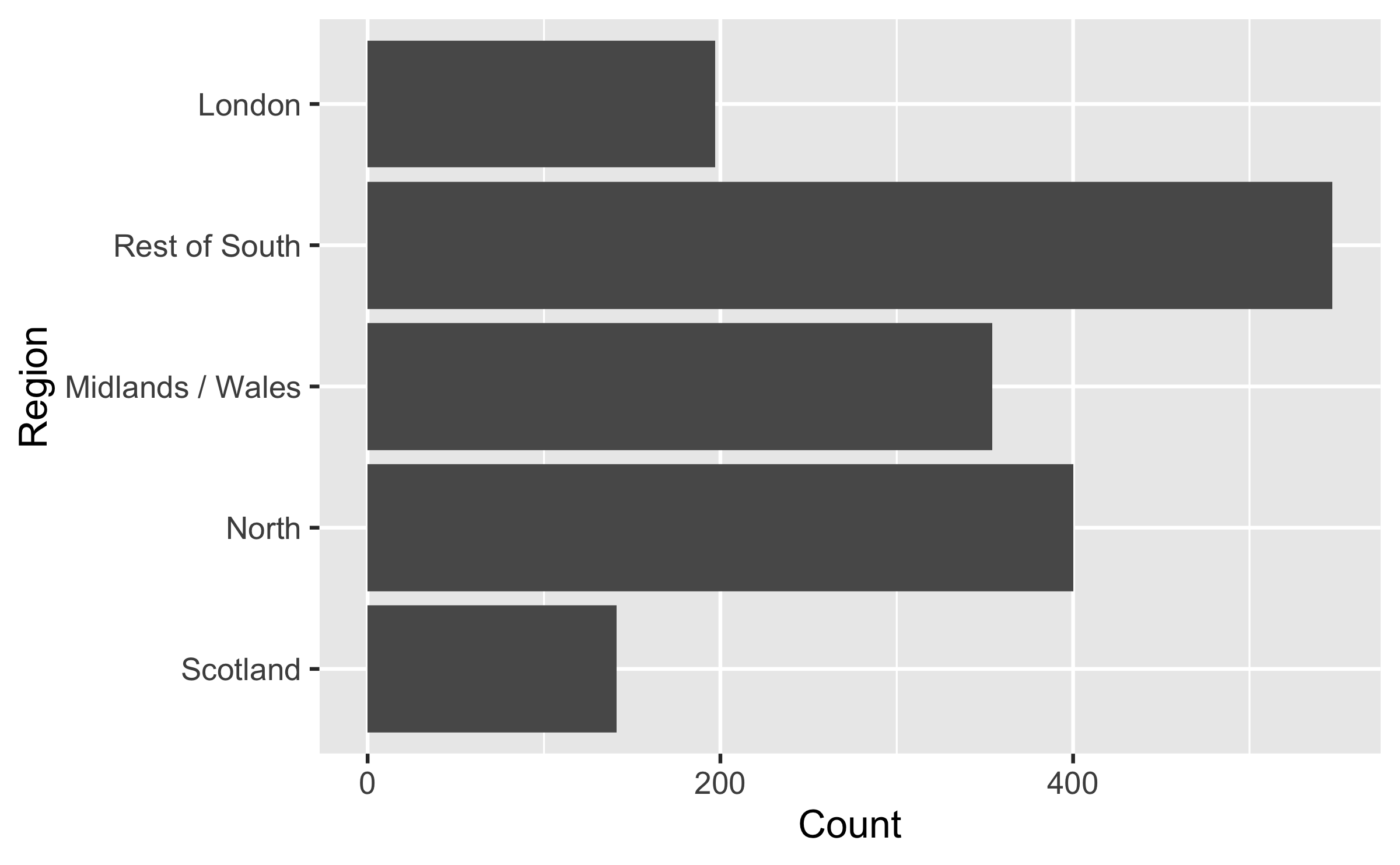
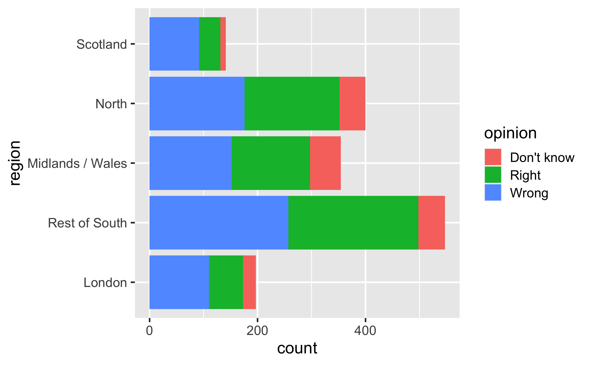
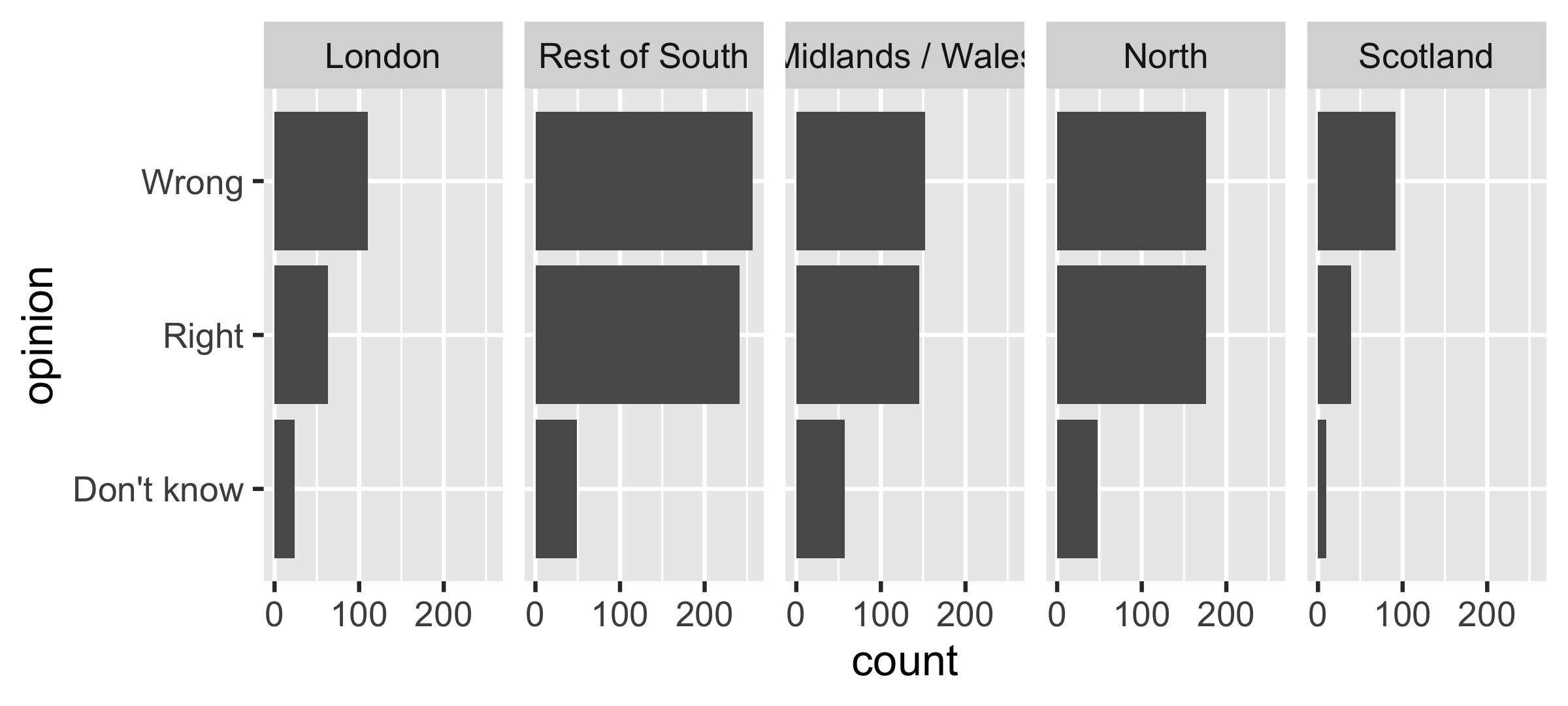
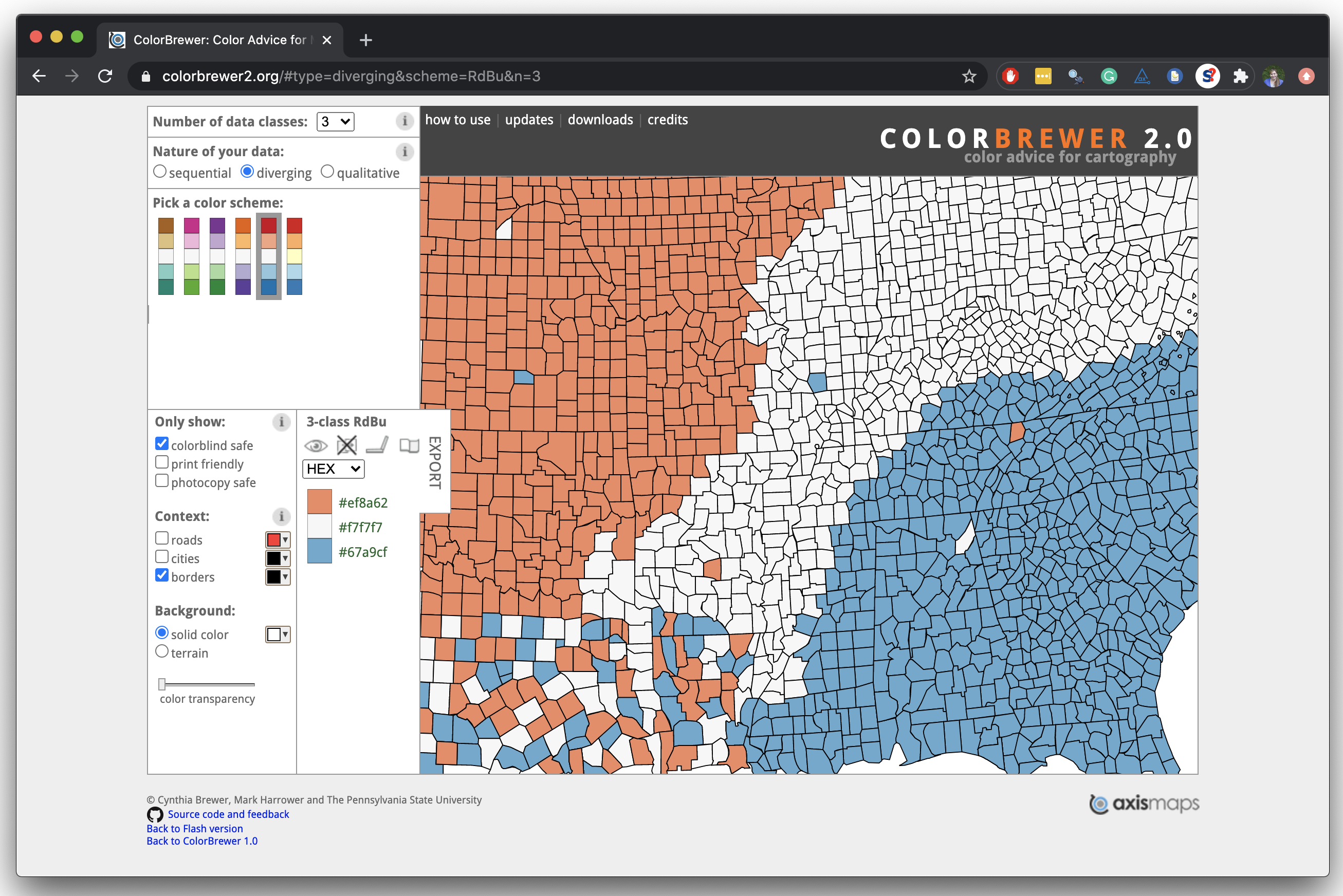
] --- layout: true <div class="my-footer"> <span> <a href="https://datasciencebox.org" target="_blank">datasciencebox.org</a> </span> </div> --- class: middle # Designing effective visualizations --- ## Keep it simple .pull-left-narrow[ <img src="img/pie-3d.jpg" width="100%" style="display: block; margin: auto;" /> ] .pull-right-wide[ <img src="u2-d14-effective-dataviz_files/figure-html/pie-to-bar-1.png" width="100%" style="display: block; margin: auto;" /> ] --- ## Use color to draw attention .pull-left[ <img src="u2-d14-effective-dataviz_files/figure-html/unnamed-chunk-2-1.png" width="100%" style="display: block; margin: auto;" /> ] .pull-right[ <img src="u2-d14-effective-dataviz_files/figure-html/unnamed-chunk-3-1.png" width="100%" style="display: block; margin: auto;" /> ] --- ## Tell a story <img src="img/time-series-story.png" width="80%" style="display: block; margin: auto;" /> .footnote[ Credit: Angela Zoss and Eric Monson, Duke DVS ] --- class: middle # Principles for effective visualizations --- ## Principles for effective visualizations - Order matters - Put long categories on the y-axis - Keep scales consistent - Select meaningful colors - Use meaningful and nonredundant labels --- ## Data In September 2019, YouGov survey asked 1,639 GB adults the following question: .pull-left[ > In hindsight, do you think Britain was right/wrong to vote to leave EU? > >- Right to leave >- Wrong to leave >- Don't know ] .pull-right[ <img src="u2-d14-effective-dataviz_files/figure-html/unnamed-chunk-6-1.png" width="100%" style="display: block; margin: auto;" /> ] .footnote[ Source: [YouGov Survey Results](https://d25d2506sfb94s.cloudfront.net/cumulus_uploads/document/x0msmggx08/YouGov%20-%20Brexit%20and%202019%20election.pdf), retrieved Oct 7, 2019 ] --- class: middle # Order matters --- ## Alphabetical order is rarely ideal .panelset[ .panel[.panel-name[Plot] <img src="u2-d14-effective-dataviz_files/figure-html/unnamed-chunk-7-1.png" width="60%" style="display: block; margin: auto;" /> ] .panel[.panel-name[Code] ```r ggplot(brexit, aes(x = opinion)) + geom_bar() ``` ] ] --- ## Order by frequency .panelset[ .panel[.panel-name[Plot] <img src="u2-d14-effective-dataviz_files/figure-html/unnamed-chunk-8-1.png" width="60%" style="display: block; margin: auto;" /> ] .panel[.panel-name[Code] `fct_infreq`: Reorder factors' levels by frequency ```r *ggplot(brexit, aes(x = fct_infreq(opinion))) + geom_bar() ``` ] ] --- ## Clean up labels .panelset[ .panel[.panel-name[Plot] <img src="u2-d14-effective-dataviz_files/figure-html/unnamed-chunk-9-1.png" width="60%" style="display: block; margin: auto;" /> ] .panel[.panel-name[Code] ```r ggplot(brexit, aes(x = opinion)) + geom_bar() + * labs( * x = "Opinion", * y = "Count" * ) ``` ] ] --- ## Alphabetical order is rarely ideal .panelset[ .panel[.panel-name[Plot] <img src="u2-d14-effective-dataviz_files/figure-html/unnamed-chunk-10-1.png" width="60%" style="display: block; margin: auto;" /> ] .panel[.panel-name[Code] ```r ggplot(brexit, aes(x = region)) + geom_bar() ``` ] ] --- ## Use inherent level order .panelset[ .panel[.panel-name[Relevel] `fct_relevel`: Reorder factor levels using a custom order ```r brexit <- brexit %>% mutate( * region = fct_relevel( region, "london", "rest_of_south", "midlands_wales", "north", "scot" ) ) ``` ] .panel[.panel-name[Plot] <img src="u2-d14-effective-dataviz_files/figure-html/unnamed-chunk-11-1.png" width="60%" style="display: block; margin: auto;" /> ] ] --- ## Clean up labels .panelset[ .panel[.panel-name[Recode] `fct_recode`: Change factor levels by hand ```r brexit <- brexit %>% mutate( * region = fct_recode( region, London = "london", `Rest of South` = "rest_of_south", `Midlands / Wales` = "midlands_wales", North = "north", Scotland = "scot" ) ) ``` ] .panel[.panel-name[Plot] <img src="u2-d14-effective-dataviz_files/figure-html/recode-plot-1.png" width="60%" style="display: block; margin: auto;" /> ] ] --- class: middle # Put long categories on the y-axis --- ## Long categories can be hard to read <img src="u2-d14-effective-dataviz_files/figure-html/unnamed-chunk-12-1.png" width="60%" style="display: block; margin: auto;" /> --- ## Move them to the y-axis .panelset[ .panel[.panel-name[Plot] <img src="u2-d14-effective-dataviz_files/figure-html/unnamed-chunk-13-1.png" width="60%" style="display: block; margin: auto;" /> ] .panel[.panel-name[Code] ```r *ggplot(brexit, aes(y = region)) + geom_bar() ``` ] ] --- ## And reverse the order of levels .panelset[ .panel[.panel-name[Plot] <img src="u2-d14-effective-dataviz_files/figure-html/unnamed-chunk-14-1.png" width="60%" style="display: block; margin: auto;" /> ] .panel[.panel-name[Code] `fct_rev`: Reverse order of factor levels ```r *ggplot(brexit, aes(y = fct_rev(region))) + geom_bar() ``` ] ] --- ## Clean up labels .panelset[ .panel[.panel-name[Plot] <img src="u2-d14-effective-dataviz_files/figure-html/unnamed-chunk-15-1.png" width="60%" style="display: block; margin: auto;" /> ] .panel[.panel-name[Code] ```r ggplot(brexit, aes(y = fct_rev(region))) + geom_bar() + * labs( * x = "Count", * y = "Region" * ) ``` ] ] --- class: middle # Pick a purpose --- ## Segmented bar plots can be hard to read .panelset[ .panel[.panel-name[Plot] <img src="u2-d14-effective-dataviz_files/figure-html/unnamed-chunk-16-1.png" width="60%" style="display: block; margin: auto;" /> ] .panel[.panel-name[Code] ```r *ggplot(brexit, aes(y = region, fill = opinion)) + geom_bar() ``` ] ] --- ## Use facets .panelset[ .panel[.panel-name[Plot] <img src="u2-d14-effective-dataviz_files/figure-html/unnamed-chunk-17-1.png" width="90%" style="display: block; margin: auto;" /> ] .panel[.panel-name[Code] ```r ggplot(brexit, aes(y = opinion, fill = region)) + geom_bar() + * facet_wrap(~region, nrow = 1) ``` ] ] --- ## Avoid redundancy? <img src="u2-d14-effective-dataviz_files/figure-html/unnamed-chunk-18-1.png" width="90%" style="display: block; margin: auto;" /> --- ## Redundancy can help tell a story .panelset[ .panel[.panel-name[Plot] <img src="u2-d14-effective-dataviz_files/figure-html/unnamed-chunk-19-1.png" width="90%" style="display: block; margin: auto;" /> ] .panel[.panel-name[Code] ```r ggplot(brexit, aes(y = opinion, fill = opinion)) + geom_bar() + facet_wrap(~region, nrow = 1) ``` ] ] --- ## Be selective with redundancy .panelset[ .panel[.panel-name[Plot] <img src="u2-d14-effective-dataviz_files/figure-html/unnamed-chunk-20-1.png" width="90%" style="display: block; margin: auto;" /> ] .panel[.panel-name[Code] ```r ggplot(brexit, aes(y = opinion, fill = opinion)) + geom_bar() + facet_wrap(~region, nrow = 1) + * guides(fill = "none") ``` ] ] --- ## Use informative labels .panelset[ .panel[.panel-name[Plot] <img src="u2-d14-effective-dataviz_files/figure-html/unnamed-chunk-21-1.png" width="90%" style="display: block; margin: auto;" /> ] .panel[.panel-name[Code] ```r ggplot(brexit, aes(y = opinion, fill = opinion)) + geom_bar() + facet_wrap(~region, nrow = 1) + guides(fill = "none") + labs( * title = "Was Britain right/wrong to vote to leave EU?", x = NULL, y = NULL ) ``` ] ] --- ## A bit more info .panelset[ .panel[.panel-name[Plot] <img src="u2-d14-effective-dataviz_files/figure-html/unnamed-chunk-22-1.png" width="90%" style="display: block; margin: auto;" /> ] .panel[.panel-name[Code] ```r ggplot(brexit, aes(y = opinion, fill = opinion)) + geom_bar() + facet_wrap(~region, nrow = 1) + guides(fill = "none") + labs( title = "Was Britain right/wrong to vote to leave EU?", * subtitle = "YouGov Survey Results, 2-3 September 2019", * caption = "Source: https://d25d2506sfb94s.cloudfront.net/cumulus_uploads/document/x0msmggx08/YouGov%20-%20Brexit%20and%202019%20election.pdf", x = NULL, y = NULL ) ``` ] ] --- ## Let's do better .panelset[ .panel[.panel-name[Plot] <img src="u2-d14-effective-dataviz_files/figure-html/unnamed-chunk-23-1.png" width="90%" style="display: block; margin: auto;" /> ] .panel[.panel-name[Code] ```r ggplot(brexit, aes(y = opinion, fill = opinion)) + geom_bar() + facet_wrap(~region, nrow = 1) + guides(fill = "none") + labs( title = "Was Britain right/wrong to vote to leave EU?", subtitle = "YouGov Survey Results, 2-3 September 2019", * caption = "Source: bit.ly/2lCJZVg", x = NULL, y = NULL ) ``` ] ] --- ## Fix up facet labels .panelset[ .panel[.panel-name[Plot] <img src="u2-d14-effective-dataviz_files/figure-html/unnamed-chunk-24-1.png" width="90%" style="display: block; margin: auto;" /> ] .panel[.panel-name[Code] ```r ggplot(brexit, aes(y = opinion, fill = opinion)) + geom_bar() + facet_wrap(~region, nrow = 1, * labeller = label_wrap_gen(width = 12) ) + guides(fill = "none") + labs( title = "Was Britain right/wrong to vote to leave EU?", subtitle = "YouGov Survey Results, 2-3 September 2019", caption = "Source: bit.ly/2lCJZVg", x = NULL, y = NULL ) ``` ] ] --- class: middle # Select meaningful colors --- ## Rainbow colors not always the right choice <img src="u2-d14-effective-dataviz_files/figure-html/unnamed-chunk-25-1.png" width="90%" style="display: block; margin: auto;" /> --- ## Manually choose colors when needed .panelset[ .panel[.panel-name[Plot] <img src="u2-d14-effective-dataviz_files/figure-html/unnamed-chunk-26-1.png" width="90%" style="display: block; margin: auto;" /> ] .panel[.panel-name[Code] ```r ggplot(brexit, aes(y = opinion, fill = opinion)) + geom_bar() + facet_wrap(~region, nrow = 1, labeller = label_wrap_gen(width = 12)) + guides(fill = "none") + labs(title = "Was Britain right/wrong to vote to leave EU?", subtitle = "YouGov Survey Results, 2-3 September 2019", caption = "Source: bit.ly/2lCJZVg", x = NULL, y = NULL) + * scale_fill_manual(values = c( * "Wrong" = "red", * "Right" = "green", * "Don't know" = "gray" * )) ``` ] ] --- ## Choosing better colors .center[.large[ [colorbrewer2.org](https://colorbrewer2.org/) ]] <img src="img/color-brewer.png" width="60%" style="display: block; margin: auto;" /> --- ## Use better colors .panelset[ .panel[.panel-name[Plot] <img src="u2-d14-effective-dataviz_files/figure-html/unnamed-chunk-28-1.png" width="90%" style="display: block; margin: auto;" /> ] .panel[.panel-name[Code] ```r ggplot(brexit, aes(y = opinion, fill = opinion)) + geom_bar() + facet_wrap(~region, nrow = 1, labeller = label_wrap_gen(width = 12)) + guides(fill = "none") + labs(title = "Was Britain right/wrong to vote to leave EU?", subtitle = "YouGov Survey Results, 2-3 September 2019", caption = "Source: bit.ly/2lCJZVg", x = NULL, y = NULL) + scale_fill_manual(values = c( * "Wrong" = "#ef8a62", * "Right" = "#67a9cf", * "Don't know" = "gray" )) ``` ] ] --- ## Select theme .panelset[ .panel[.panel-name[Plot] <img src="u2-d14-effective-dataviz_files/figure-html/unnamed-chunk-29-1.png" width="90%" style="display: block; margin: auto;" /> ] .panel[.panel-name[Code] ```r ggplot(brexit, aes(y = opinion, fill = opinion)) + geom_bar() + facet_wrap(~region, nrow = 1, labeller = label_wrap_gen(width = 12)) + guides(fill = "none") + labs(title = "Was Britain right/wrong to vote to leave EU?", subtitle = "YouGov Survey Results, 2-3 September 2019", caption = "Source: bit.ly/2lCJZVg", x = NULL, y = NULL) + scale_fill_manual(values = c("Wrong" = "#ef8a62", "Right" = "#67a9cf", "Don't know" = "gray")) + * theme_minimal() ``` ] ] --- .your-turn[ ### .hand[Your turn!] .midi[ - RStudio Cloud > `AE 07 - Brexit + Telling stories with dataviz` > `brexit.Rmd`. - Change the visualisation in three different ways to tell slightly different stories with it each time. ] ]