Keep it simple
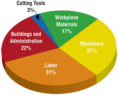
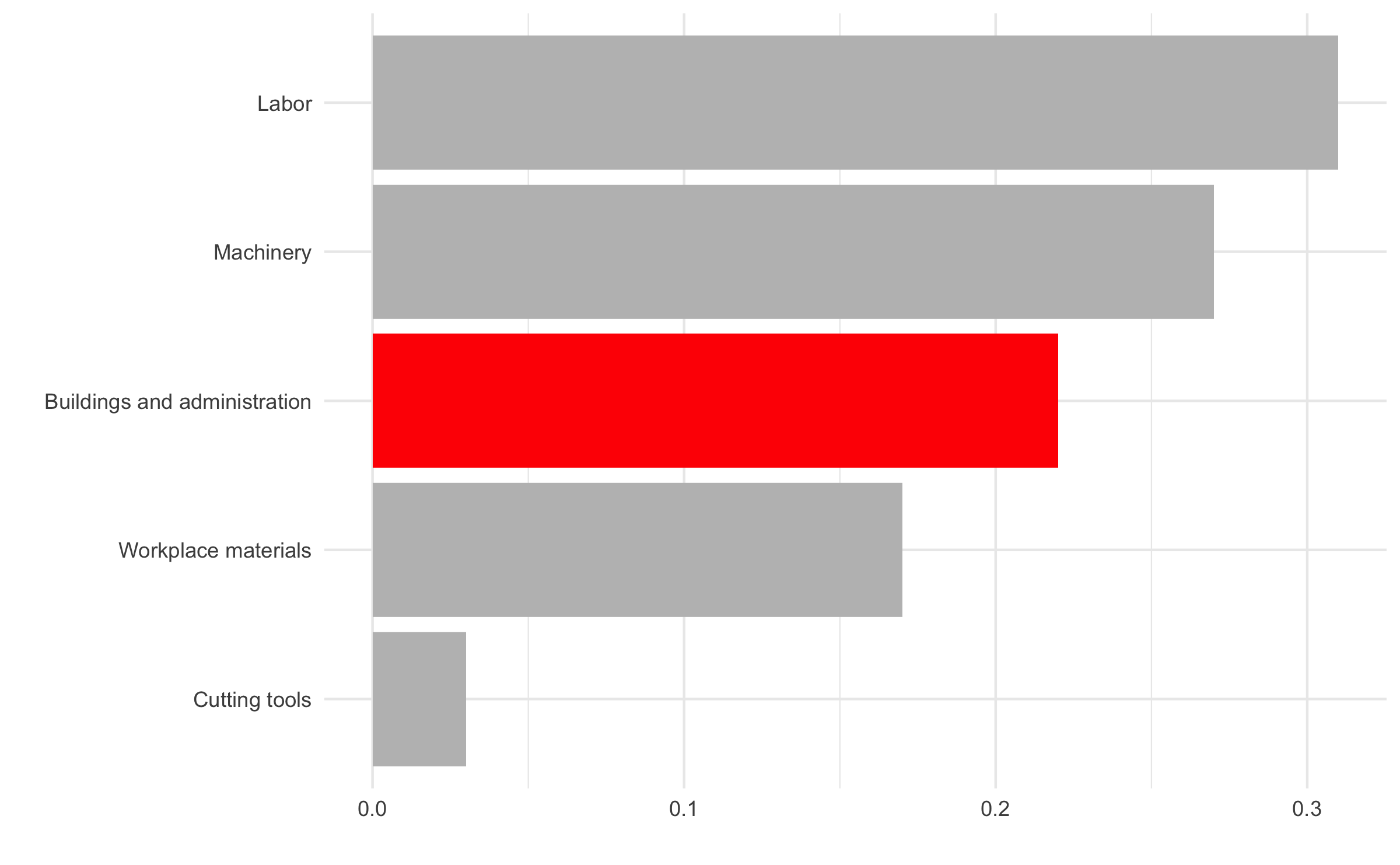
Use color to draw attention
Tell a story
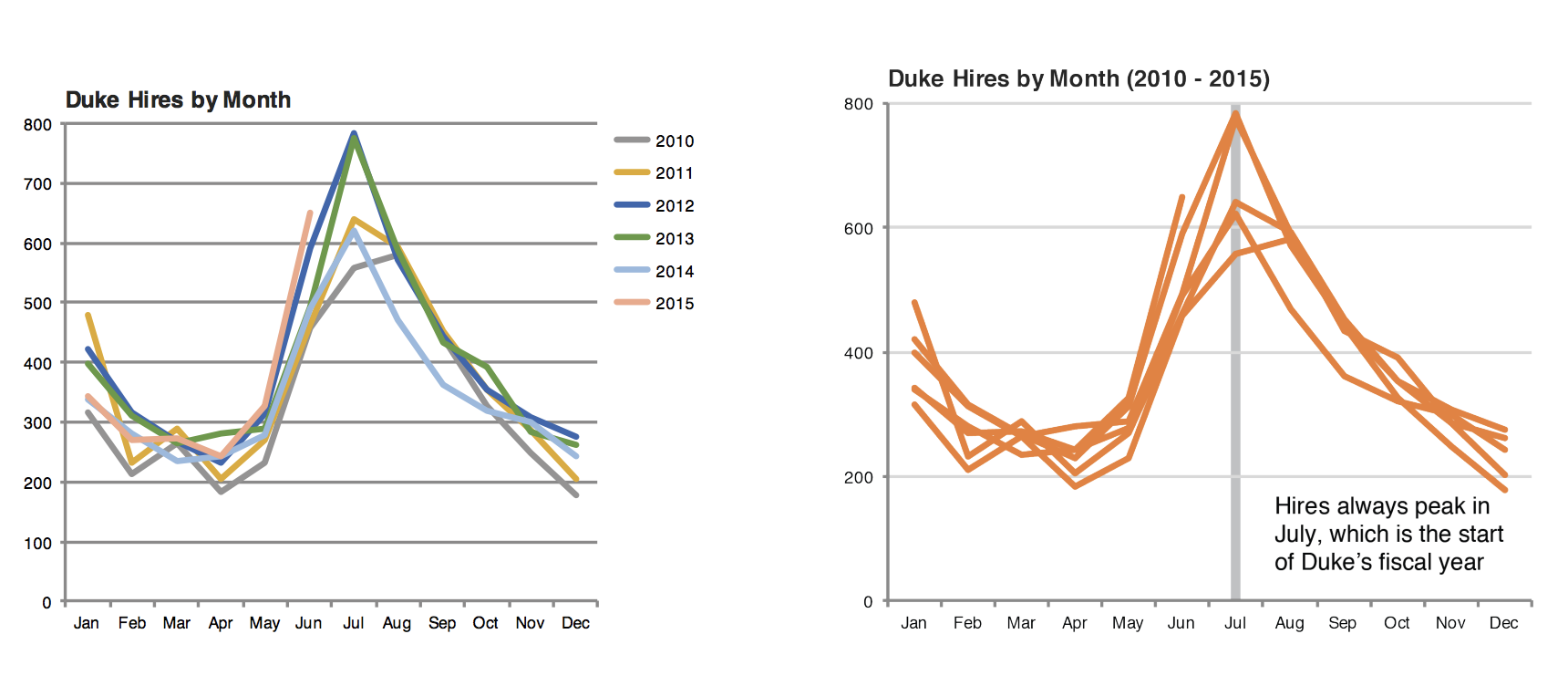
Credit: Angela Zoss and Eric Monson, Duke DVS
Data
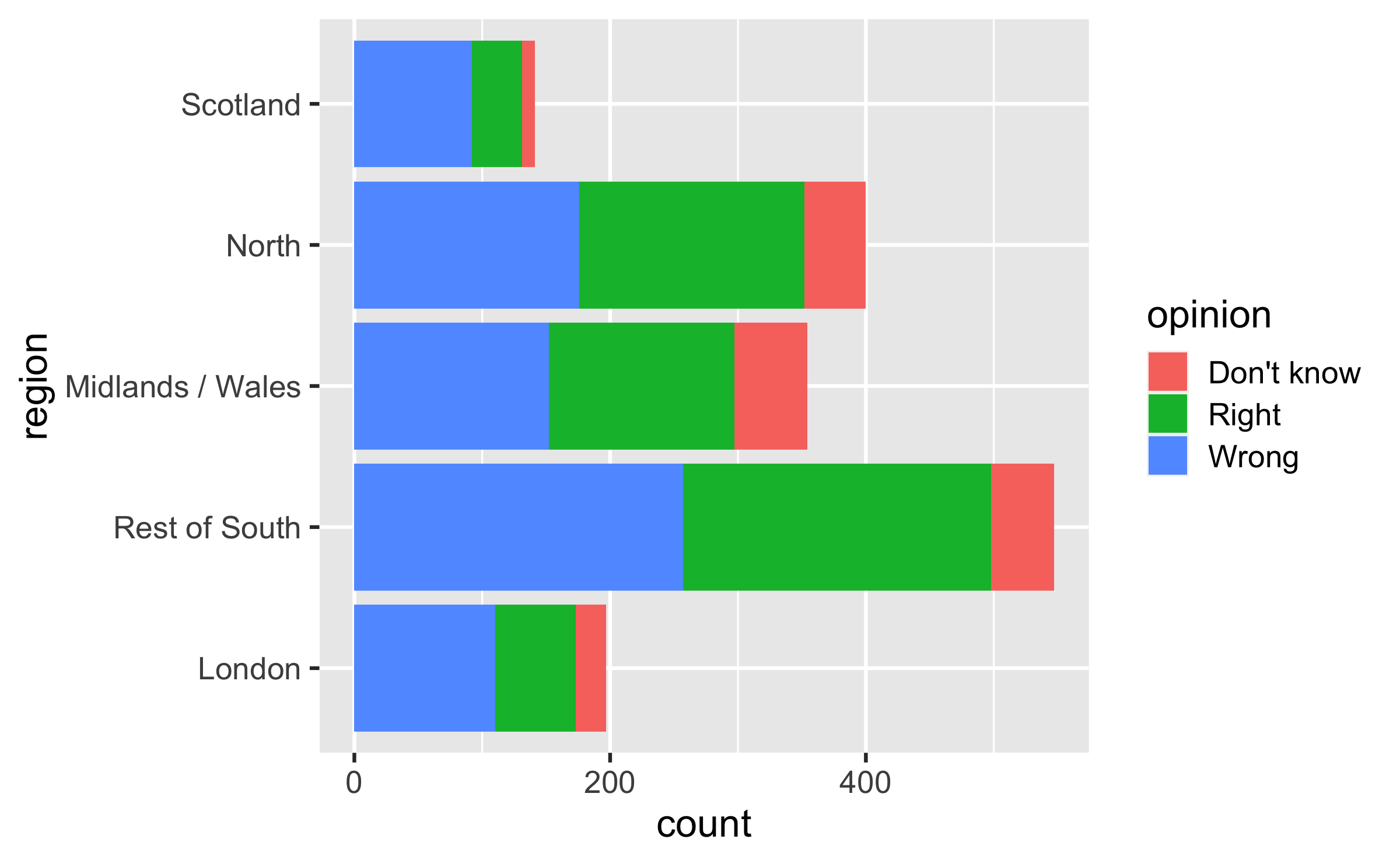
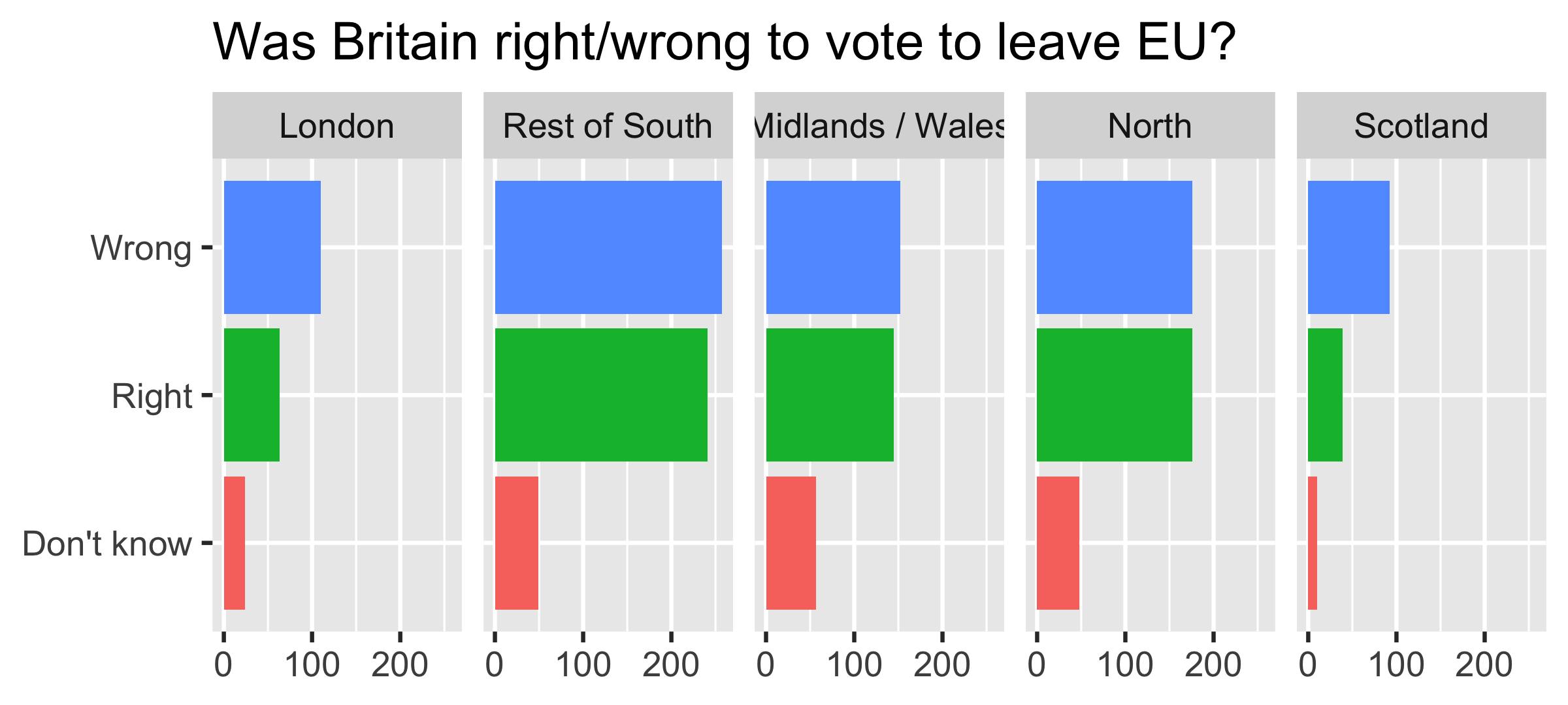
In September 2019, YouGov survey asked 1,639 GB adults the following question:
In hindsight, do you think Britain was right/wrong to vote to leave EU?
- Right to leave
- Wrong to leave
- Don't know

Source: YouGov Survey Results, retrieved Oct 7, 2019
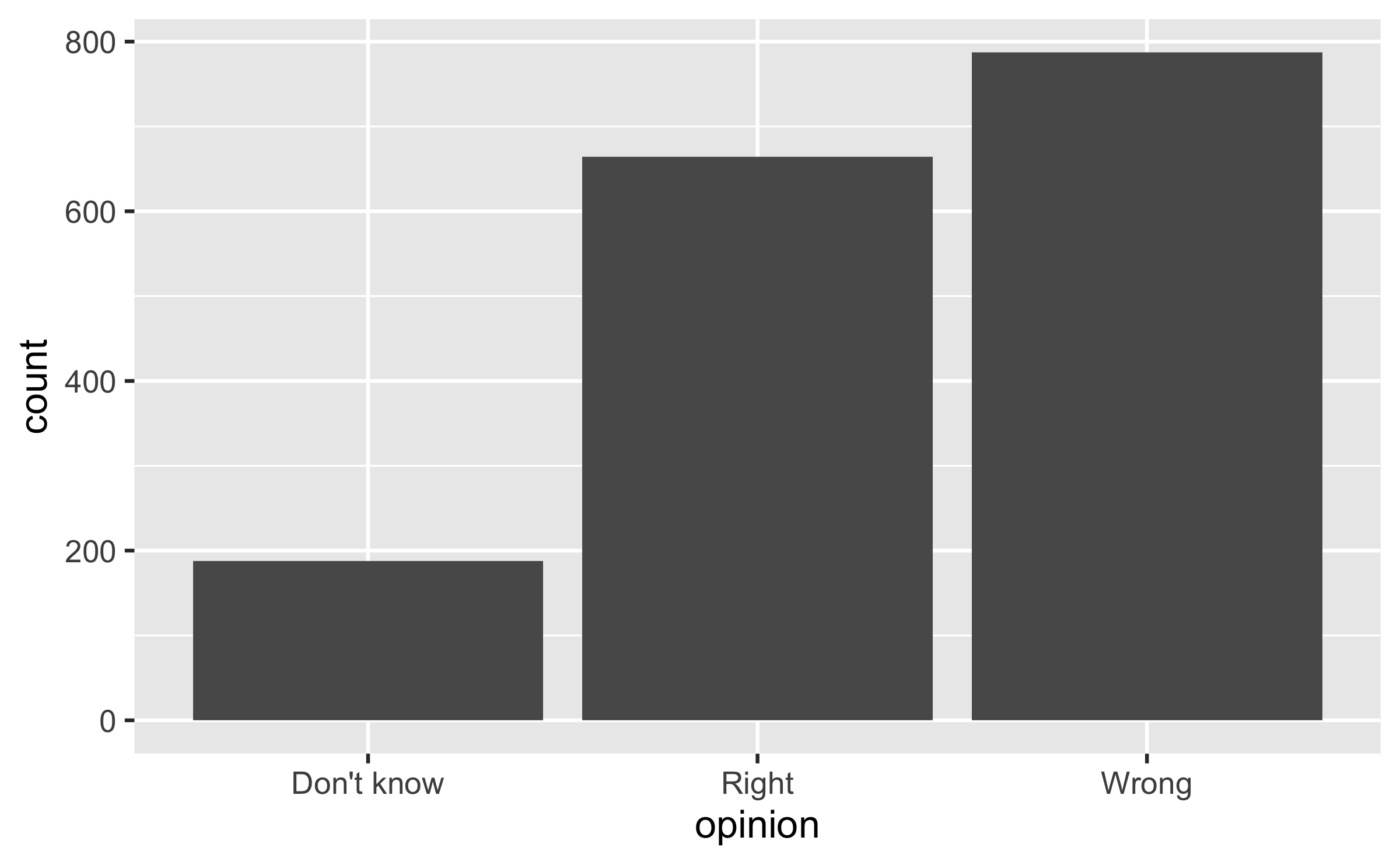
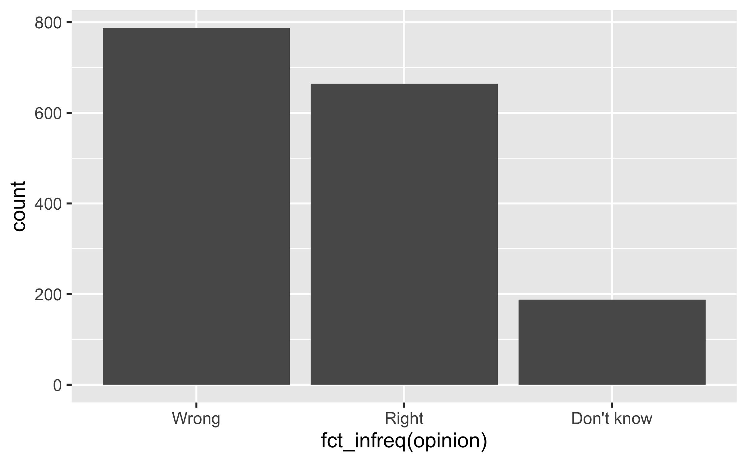


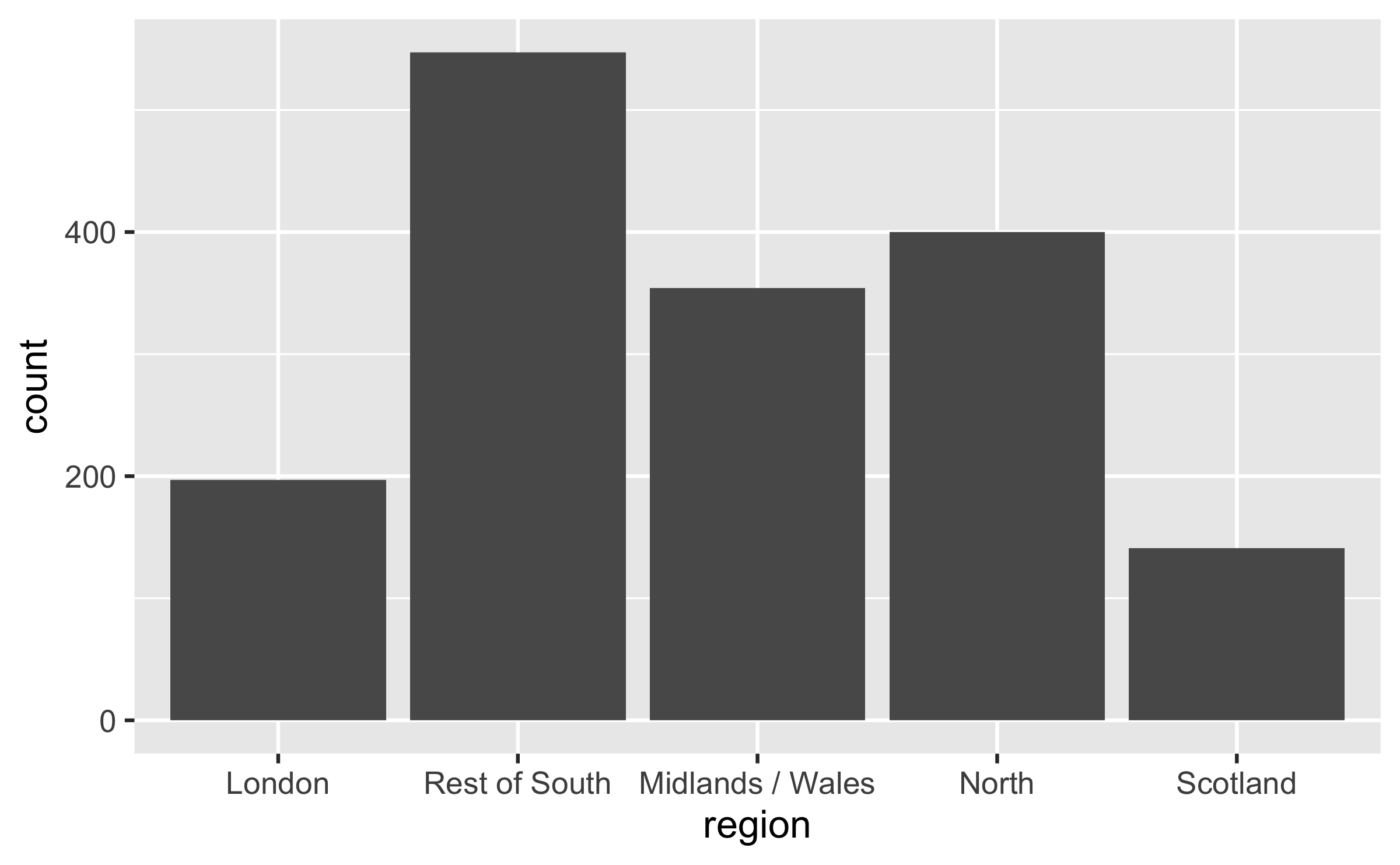
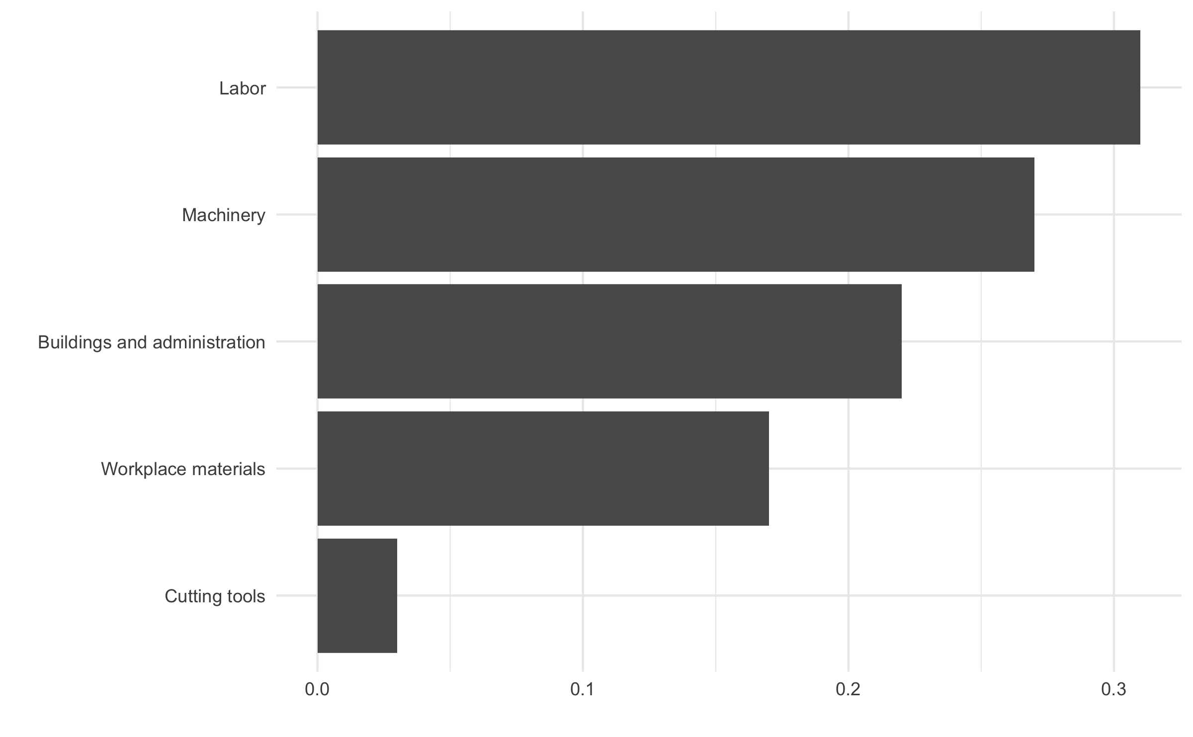
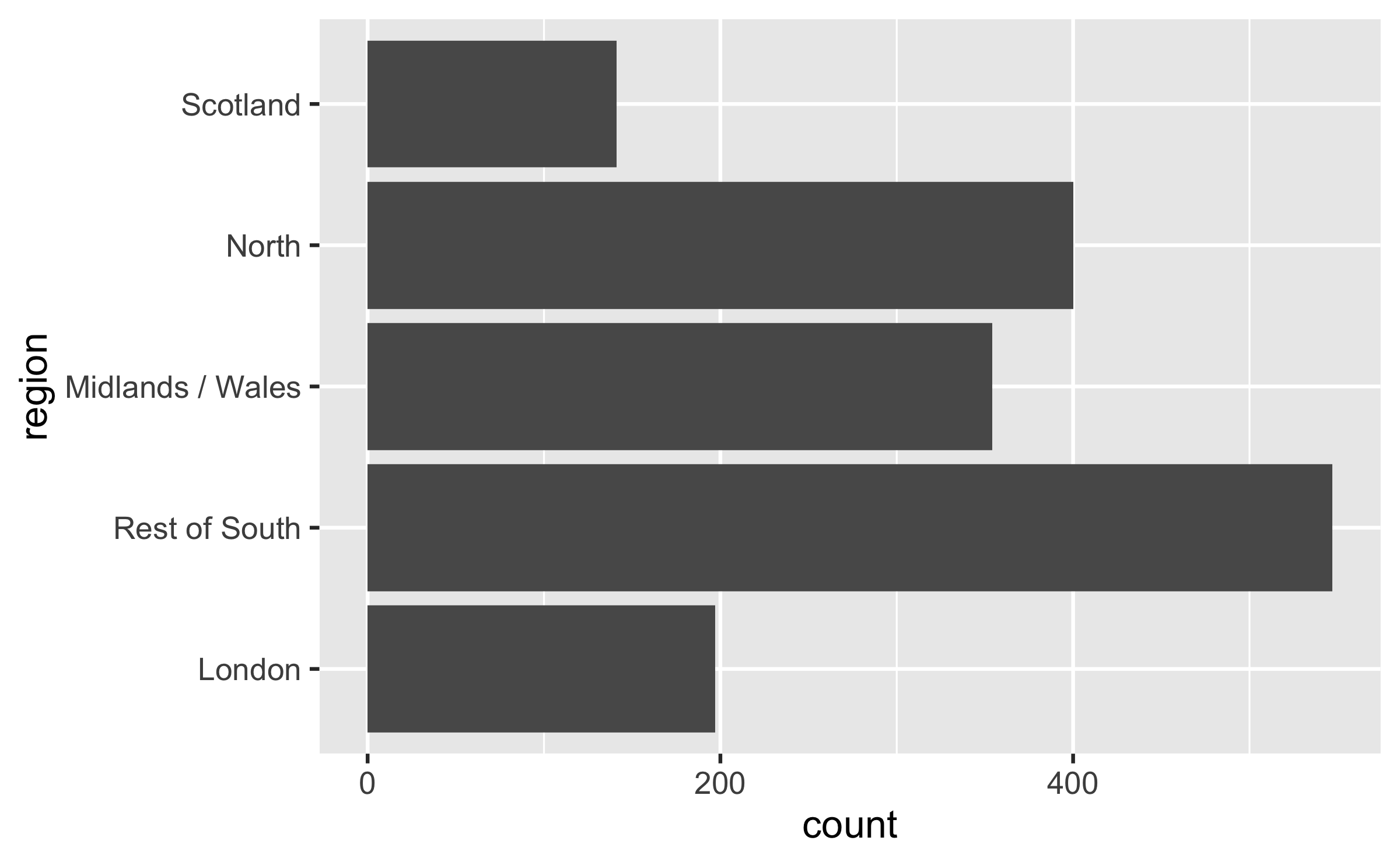
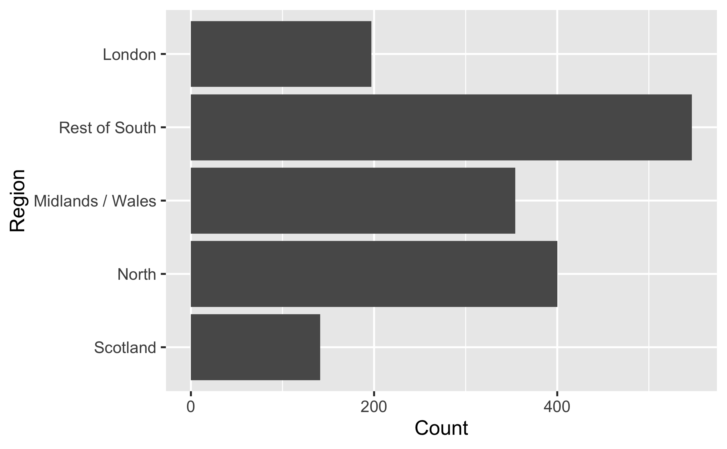
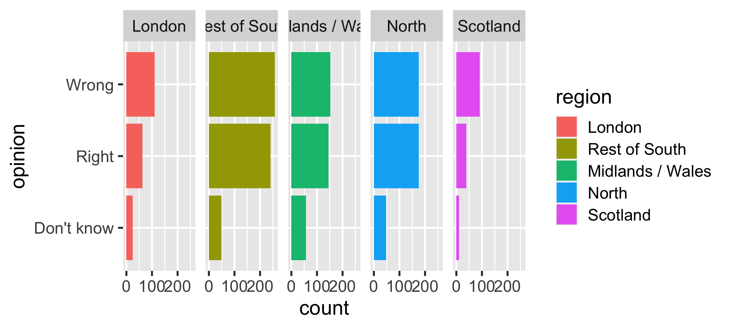
Long categories can be hard to read


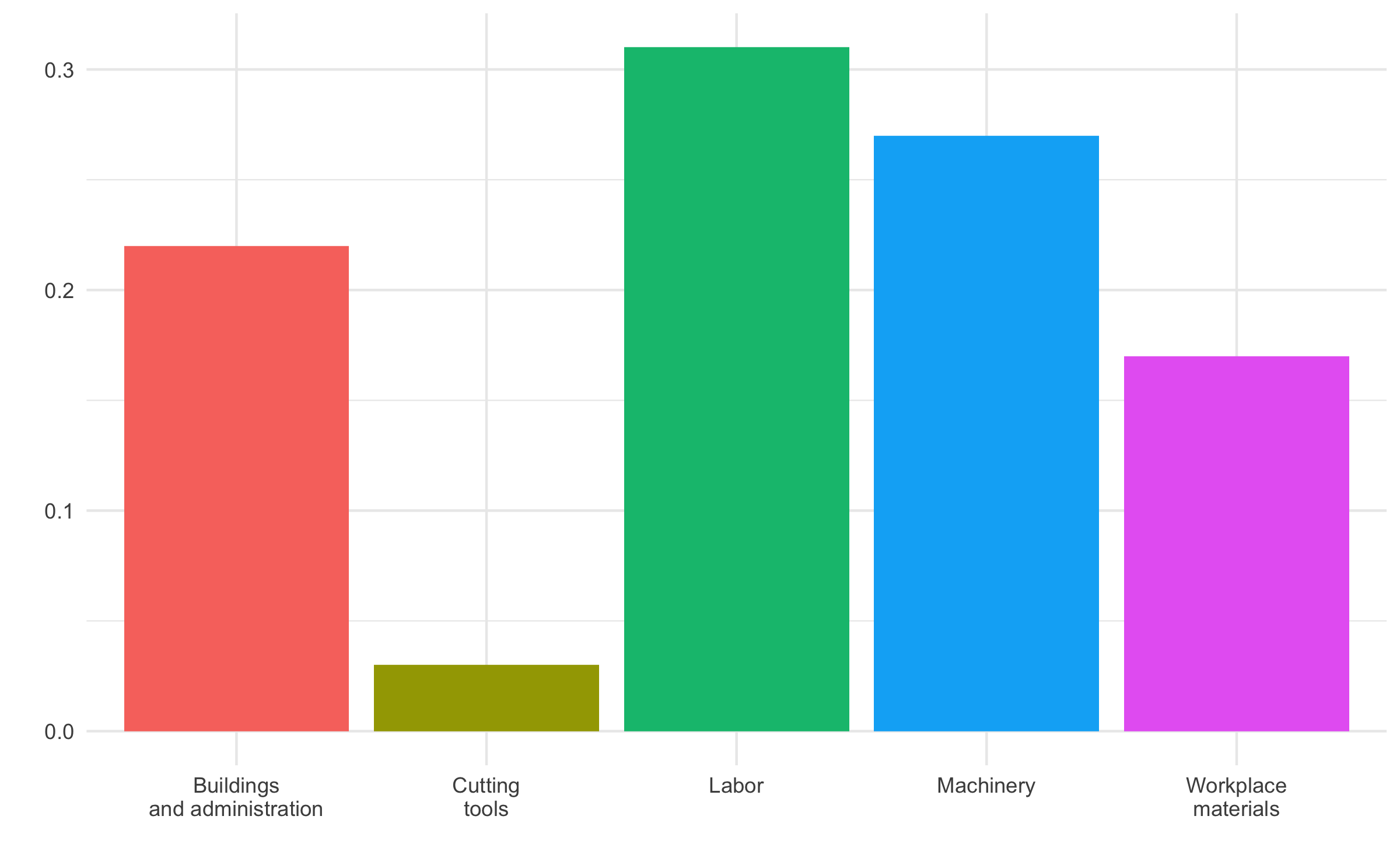
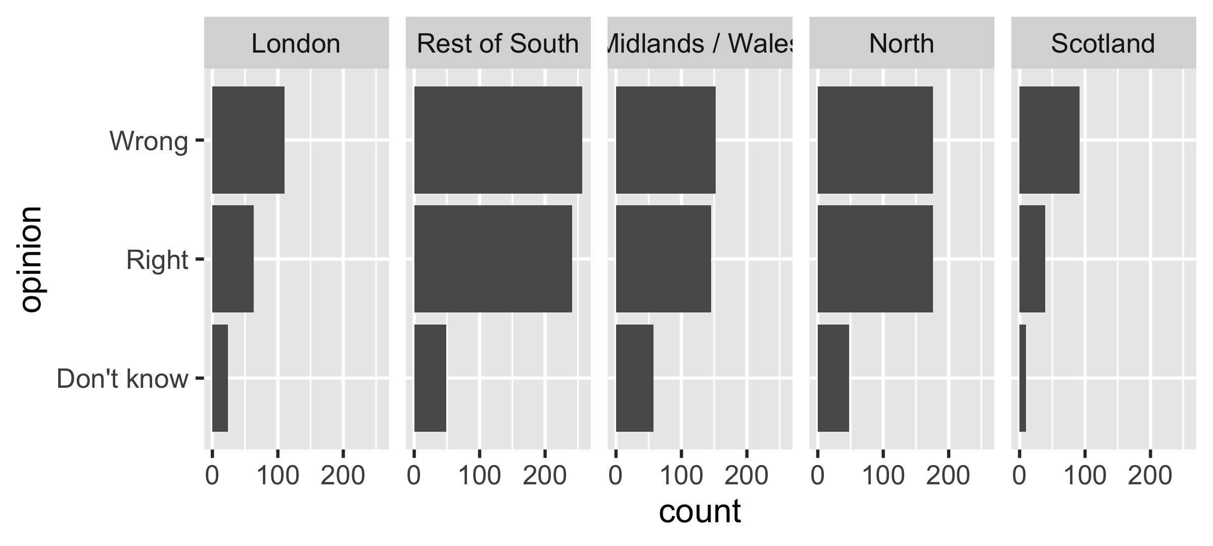
Avoid redundancy?
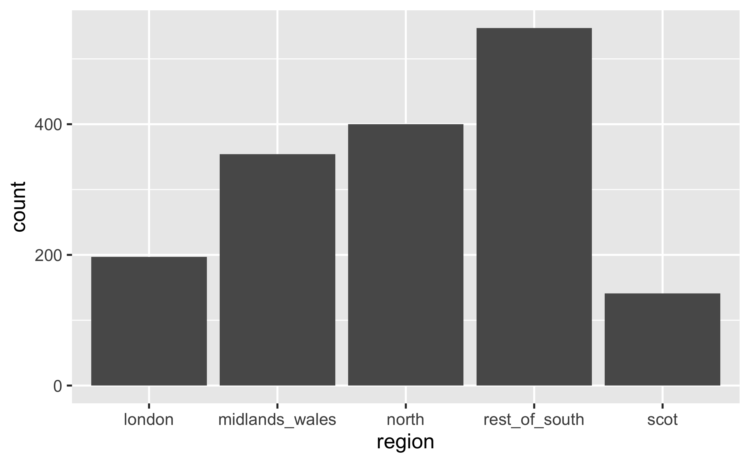
A bit more info
ggplot(brexit, aes(y = opinion, fill = opinion)) + geom_bar() + facet_wrap(~region, nrow = 1) + guides(fill = "none") + labs( title = "Was Britain right/wrong to vote to leave EU?", subtitle = "YouGov Survey Results, 2-3 September 2019", caption = "Source: https://d25d2506sfb94s.cloudfront.net/cumulus_uploads/document/x0msmggx08/YouGov%20-%20Brexit%20and%202019%20election.pdf", x = NULL, y = NULL )Let's do better
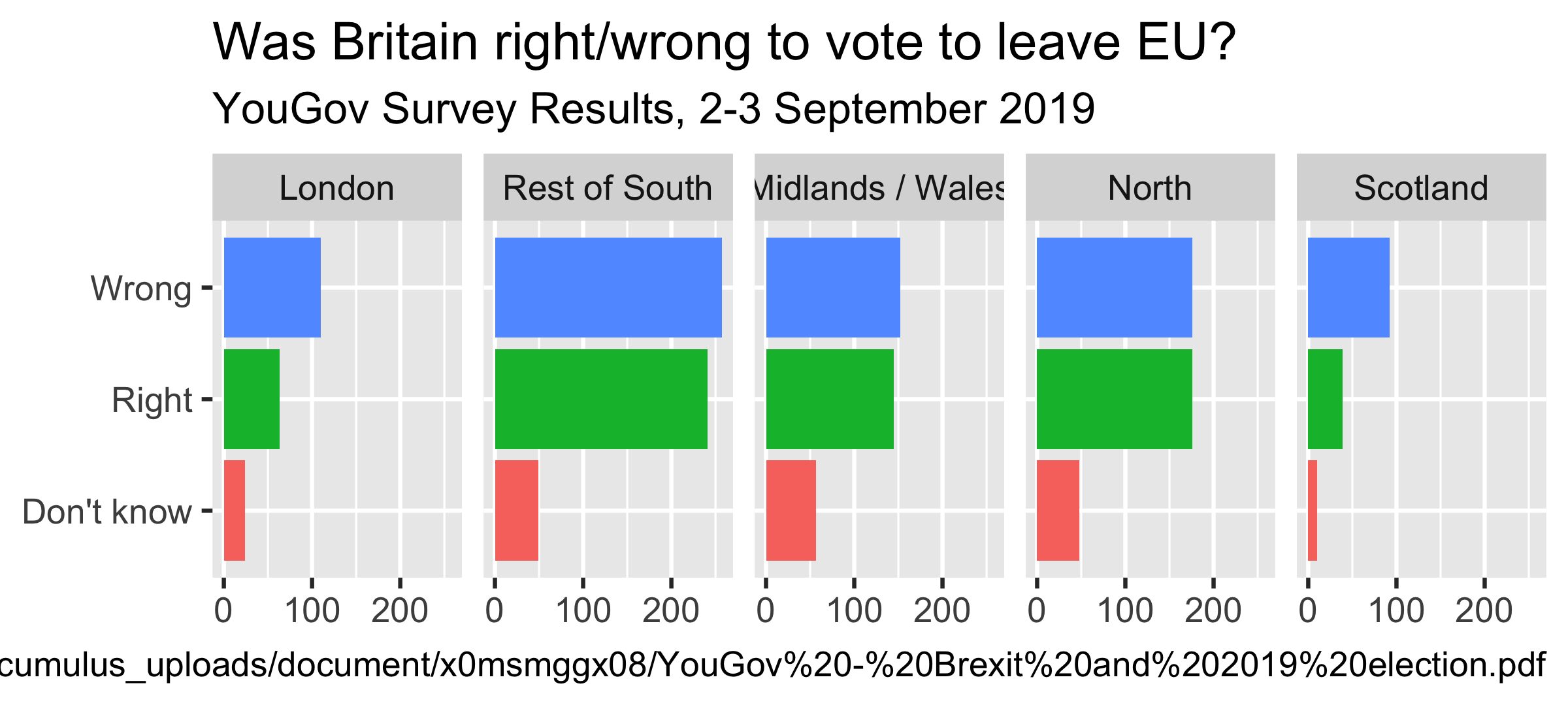
ggplot(brexit, aes(y = opinion, fill = opinion)) + geom_bar() + facet_wrap(~region, nrow = 1) + guides(fill = "none") + labs( title = "Was Britain right/wrong to vote to leave EU?", subtitle = "YouGov Survey Results, 2-3 September 2019", caption = "Source: bit.ly/2lCJZVg", x = NULL, y = NULL )Fix up facet labels
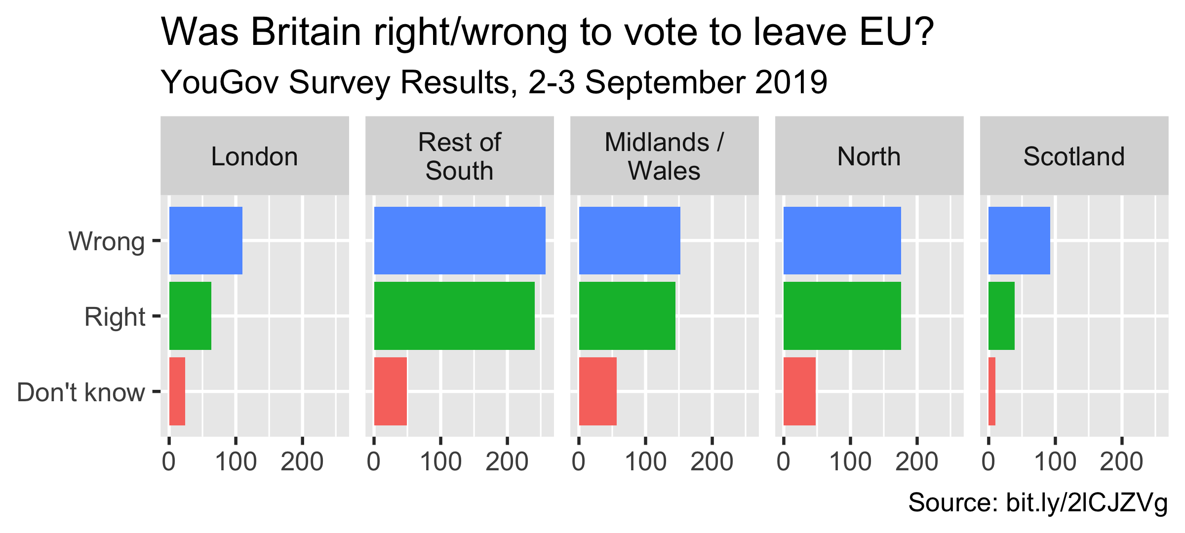
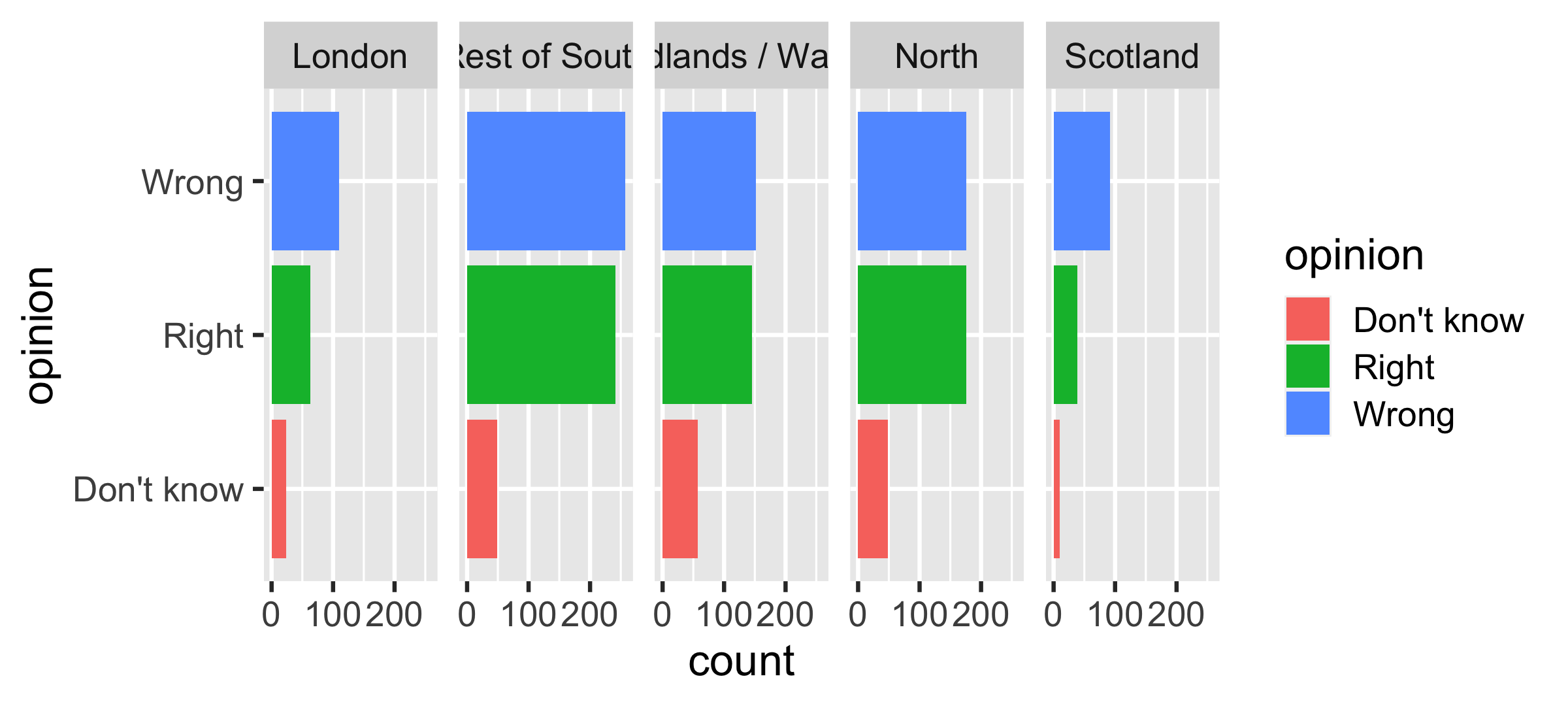
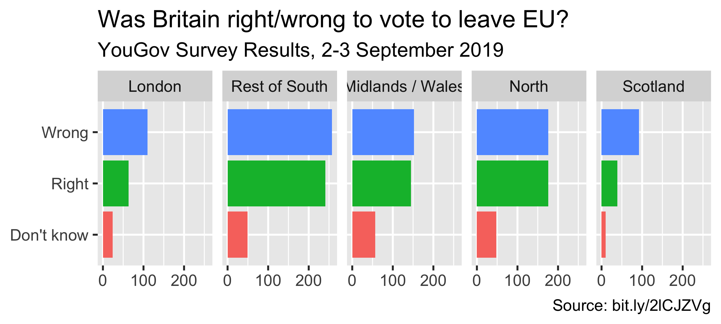
ggplot(brexit, aes(y = opinion, fill = opinion)) + geom_bar() + facet_wrap(~region, nrow = 1, labeller = label_wrap_gen(width = 12) ) + guides(fill = "none") + labs( title = "Was Britain right/wrong to vote to leave EU?", subtitle = "YouGov Survey Results, 2-3 September 2019", caption = "Source: bit.ly/2lCJZVg", x = NULL, y = NULL )Rainbow colors not always the right choice

Manually choose colors when needed
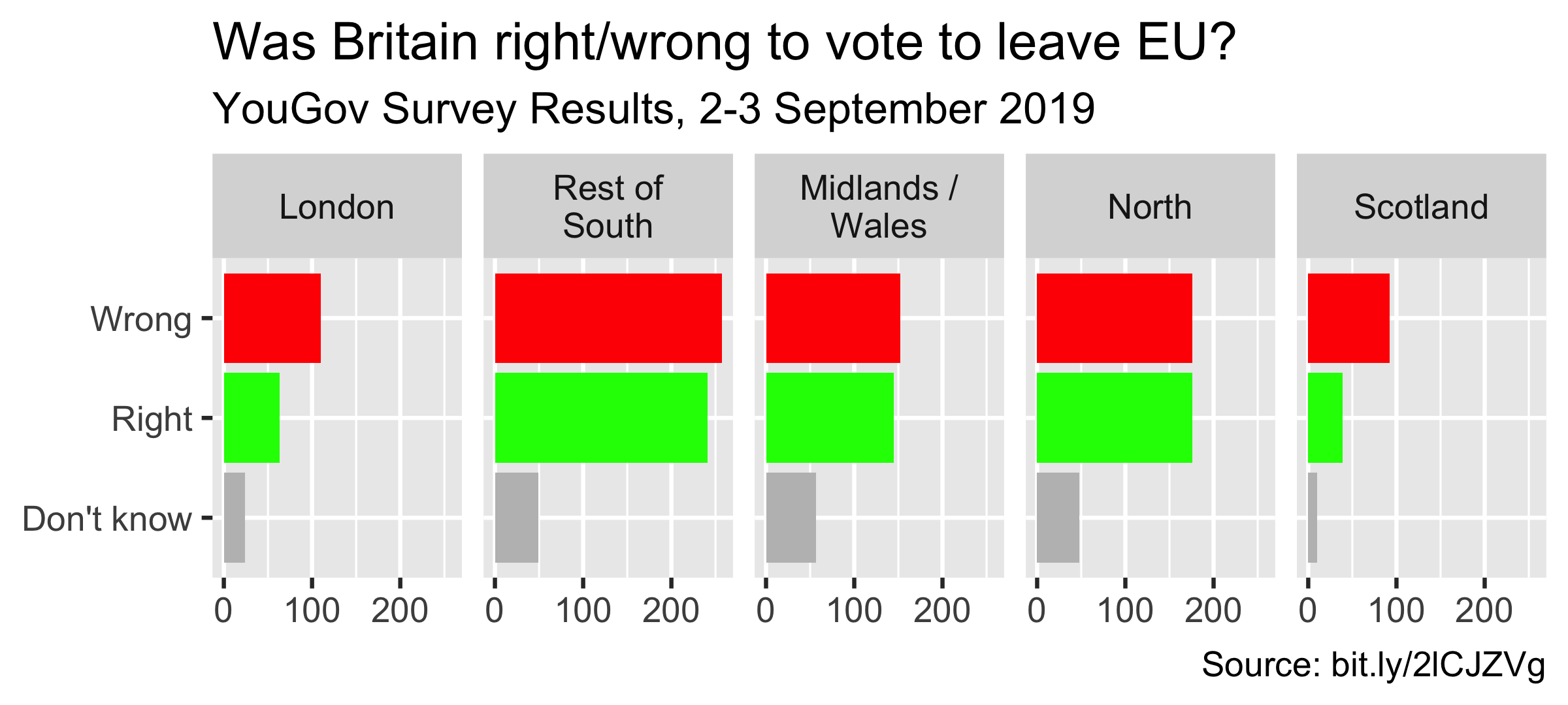
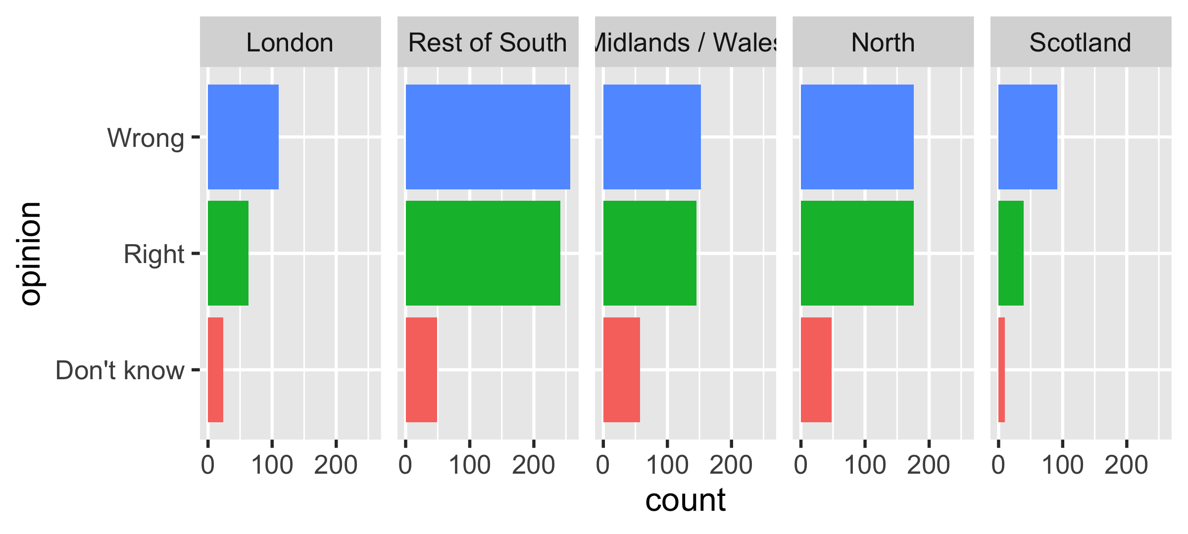
ggplot(brexit, aes(y = opinion, fill = opinion)) + geom_bar() + facet_wrap(~region, nrow = 1, labeller = label_wrap_gen(width = 12)) + guides(fill = "none") + labs(title = "Was Britain right/wrong to vote to leave EU?", subtitle = "YouGov Survey Results, 2-3 September 2019", caption = "Source: bit.ly/2lCJZVg", x = NULL, y = NULL) + scale_fill_manual(values = c( "Wrong" = "red", "Right" = "green", "Don't know" = "gray" ))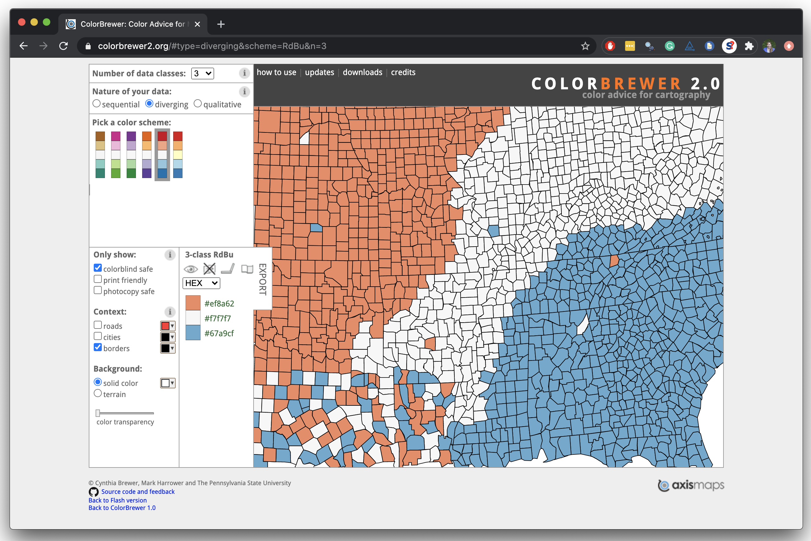
Use better colors
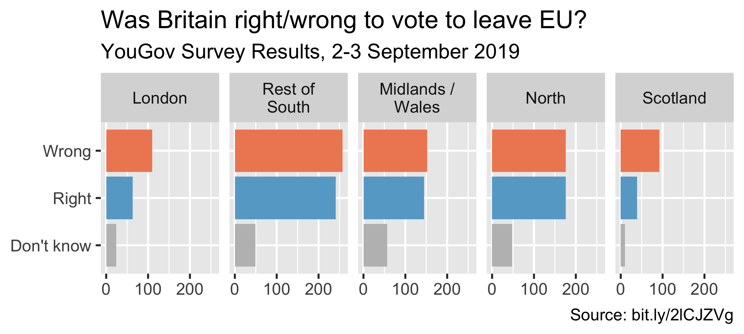
ggplot(brexit, aes(y = opinion, fill = opinion)) + geom_bar() + facet_wrap(~region, nrow = 1, labeller = label_wrap_gen(width = 12)) + guides(fill = "none") + labs(title = "Was Britain right/wrong to vote to leave EU?", subtitle = "YouGov Survey Results, 2-3 September 2019", caption = "Source: bit.ly/2lCJZVg", x = NULL, y = NULL) + scale_fill_manual(values = c( "Wrong" = "#ef8a62", "Right" = "#67a9cf", "Don't know" = "gray" ))Select theme
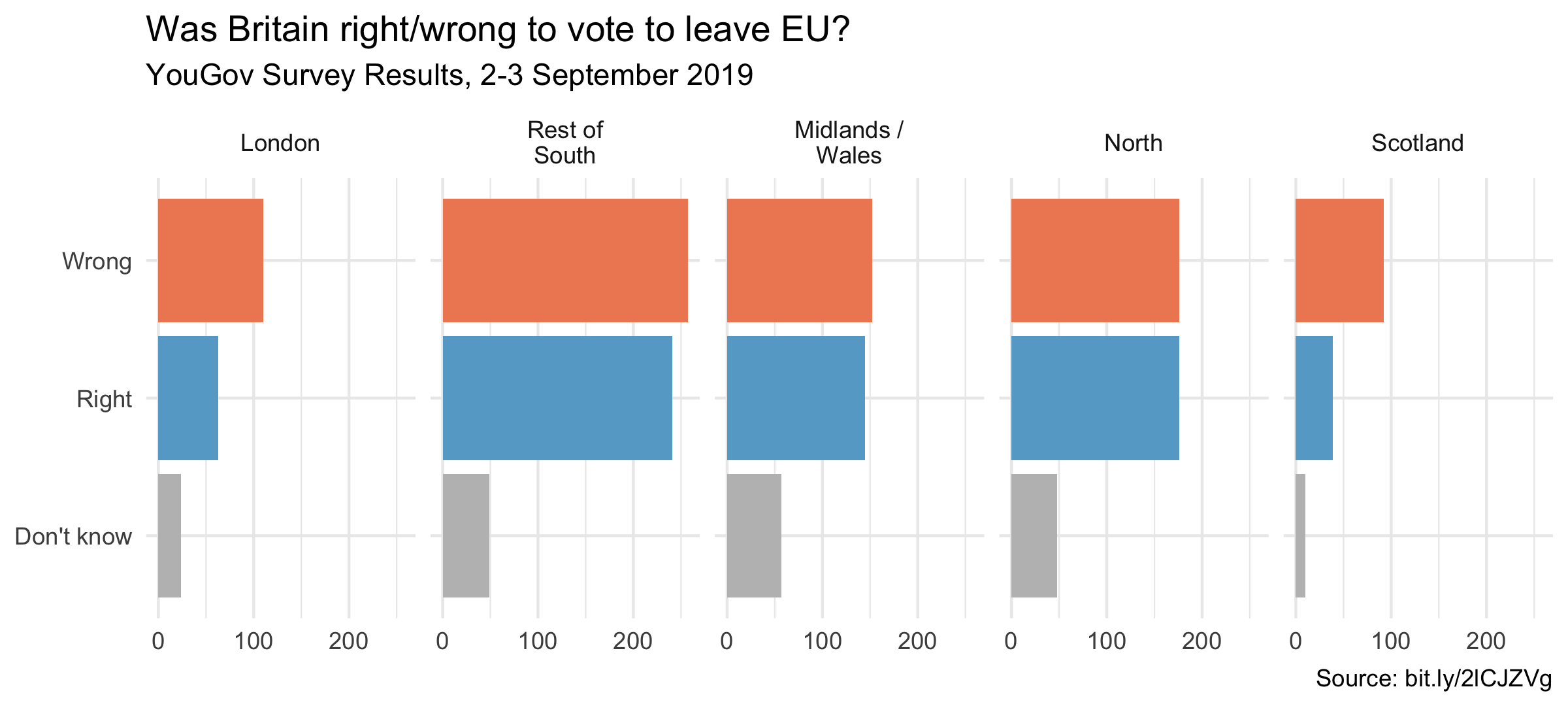
ggplot(brexit, aes(y = opinion, fill = opinion)) + geom_bar() + facet_wrap(~region, nrow = 1, labeller = label_wrap_gen(width = 12)) + guides(fill = "none") + labs(title = "Was Britain right/wrong to vote to leave EU?", subtitle = "YouGov Survey Results, 2-3 September 2019", caption = "Source: bit.ly/2lCJZVg", x = NULL, y = NULL) + scale_fill_manual(values = c("Wrong" = "#ef8a62", "Right" = "#67a9cf", "Don't know" = "gray")) + theme_minimal()