Lab 07 - Smokers in Whickham
Simpson’s paradox
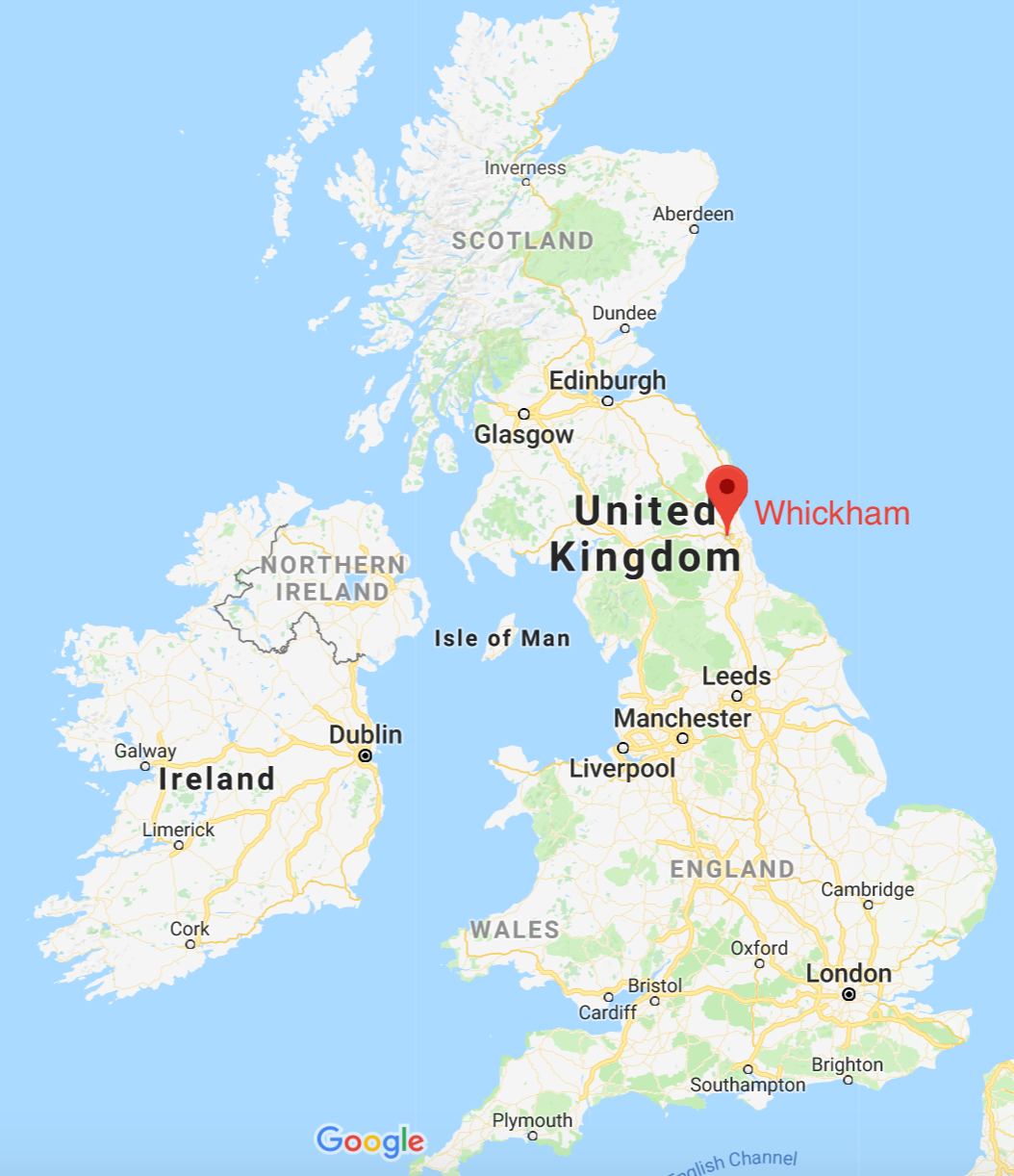
A study of conducted in Whickham, England recorded participants’ age, smoking status at baseline, and then 20 years later recorded their health outcome. In this lab we analyse the relationships between these variables, first two at a time, and then controlling for the third.
Learning goals
- Visualising relationships between variables
- Discovering Simpson’s paradox via visualisations
Getting started
Go to the course GitHub organization and locate your homework repo, clone it in RStudio and open the R Markdown document. Knit the document to make sure it compiles without errors.
Warm up
Before we introduce the data, let’s warm up with some simple exercises. Update the YAML of your R Markdown file with your information, knit, commit, and push your changes. Make sure to commit with a meaningful commit message. Then, go to your repo on GitHub and confirm that your changes are visible in your Rmd and md files. If anything is missing, commit and push again.
Packages
We’ll use the tidyverse package for much of the data wrangling and visualisation and the data lives in the mosaicData package. These packages are already installed for you. You can load them by running the following in your Console:
library(tidyverse)
library(mosaicData)
Data
The dataset we’ll use is called Whickham from the mosaicData package. You can find out more about the dataset by inspecting their documentation, which you can access by running ?Whickham in the Console or using the Help menu in RStudio to search for Whickham.
Exercises
What type of study do you think these data come from: observational or experiment? Why?
How many observations are in this dataset? What does each observation represent?
How many variables are in this dataset? What type of variable is each? Display each variable using an appropriate visualization.
What would you expect the relationship between smoking status and health outcome to be?
🧶 ✅ ⬆️ Knit, commit, and push your changes to GitHub with an appropriate commit message. Make sure to commit and push all changed files so that your Git pane is cleared up afterwards.
- Create a visualization depicting the relationship between smoking status and health outcome. Briefly describe the relationship, and evaluate whether this meets your expectations. Additionally, calculate the relevant conditional probabilities to help your narrative. Here is some code to get you started:
Whickham %>%
count(smoker, outcome)- Create a new variable called
age_catusing the following scheme:
age <= 44 ~ "18-44"age > 44 & age <= 64 ~ "45-64"age > 64 ~ "65+"
- Re-create the visualization depicting the relationship between smoking status and health outcome, faceted by
age_cat. What changed? What might explain this change? Extend the contingency table from earlier by breaking it down by age category and use it to help your narrative.
Whickham %>%
  count(smoker, age_cat, outcome)
🧶 ✅ ⬆️ Knit, commit, and push your changes to GitHub with an appropriate commit message. Make sure to commit and push all changed files so that your Git pane is cleared up afterwards and review the md document on GitHub to make sure you’re happy with the final state of your work.